AO1 Contextual Understanding
'Develop their ideas through sustained and focsued investigations informed by contextual and other sources, demonstarting analytical and critical understanding'
Mind Map
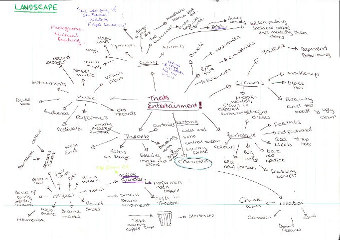
My mind map for my final piece ideas, on my theme, 'that's entertainment!'.
Idea Sheets
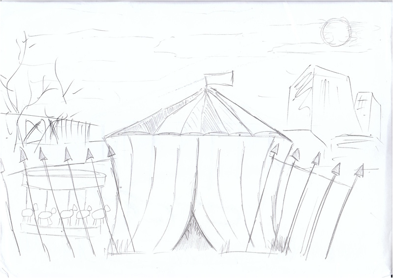
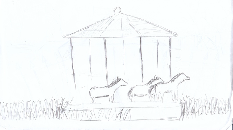
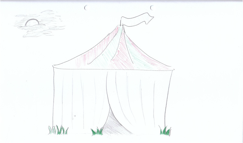
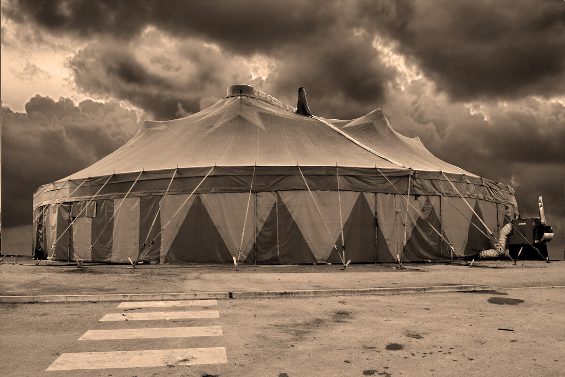
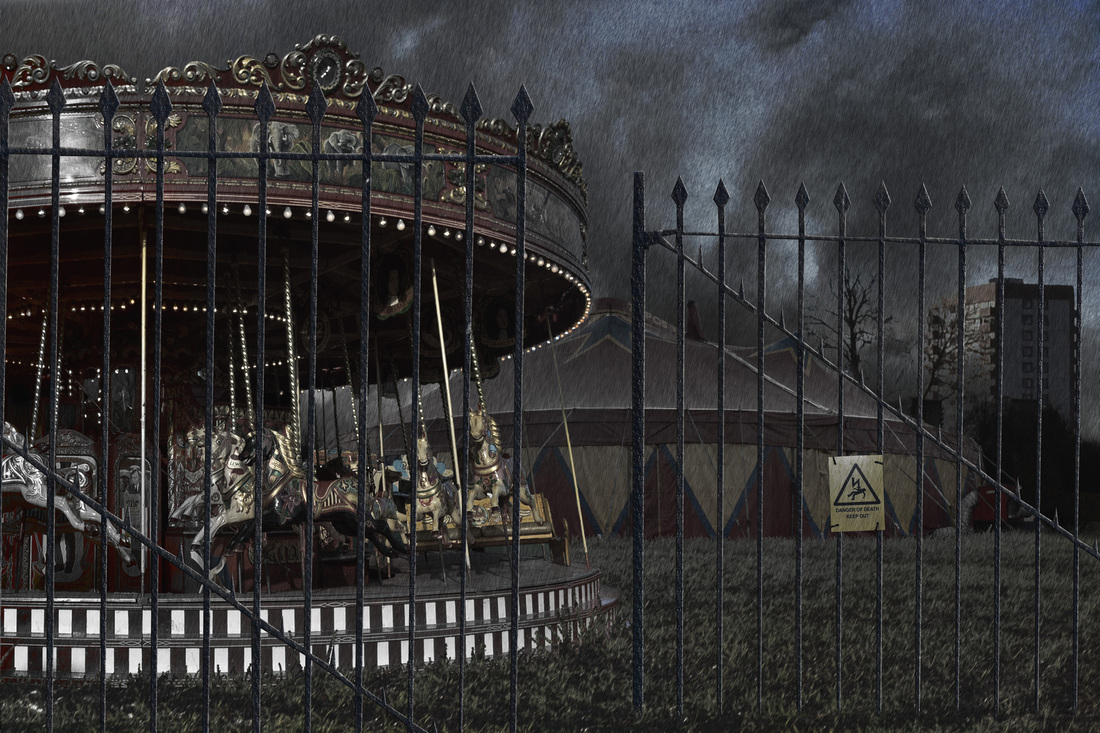
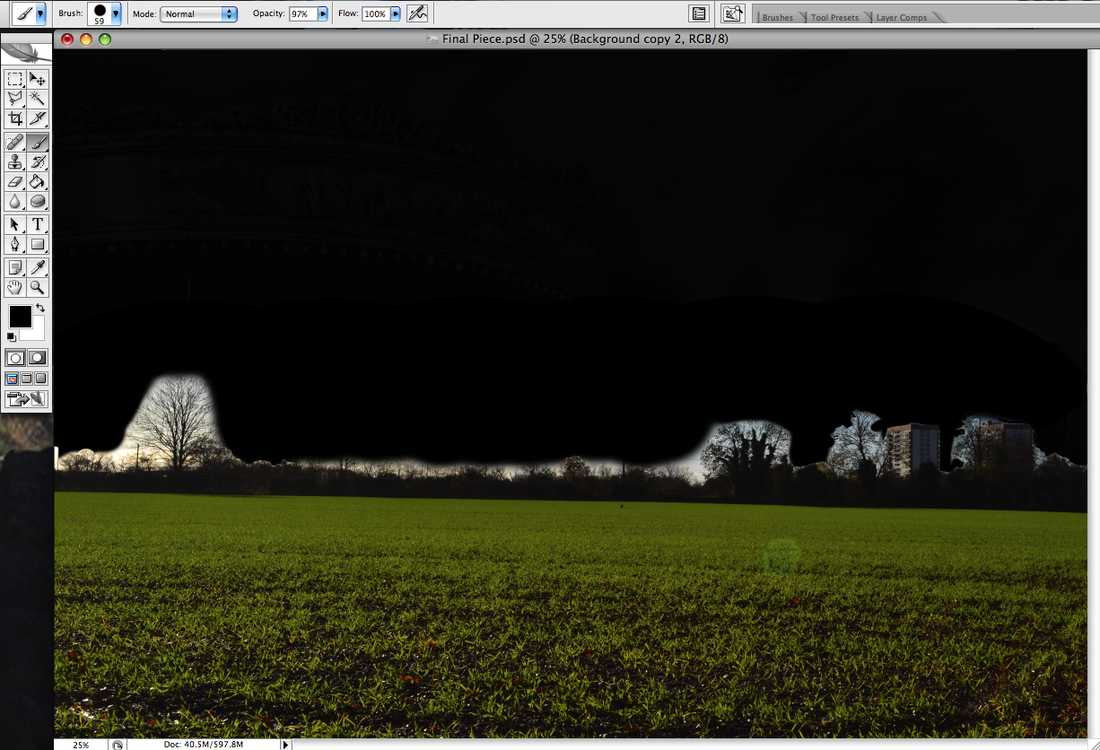
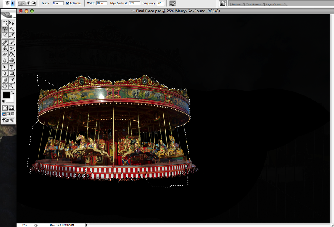
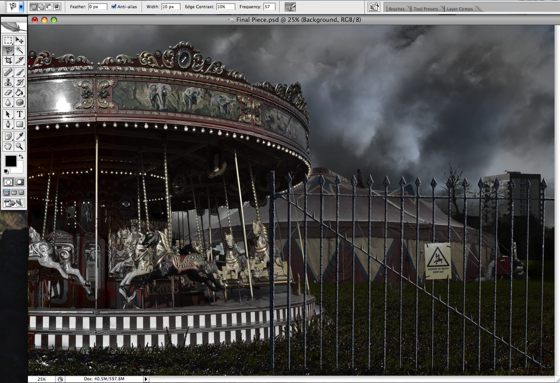
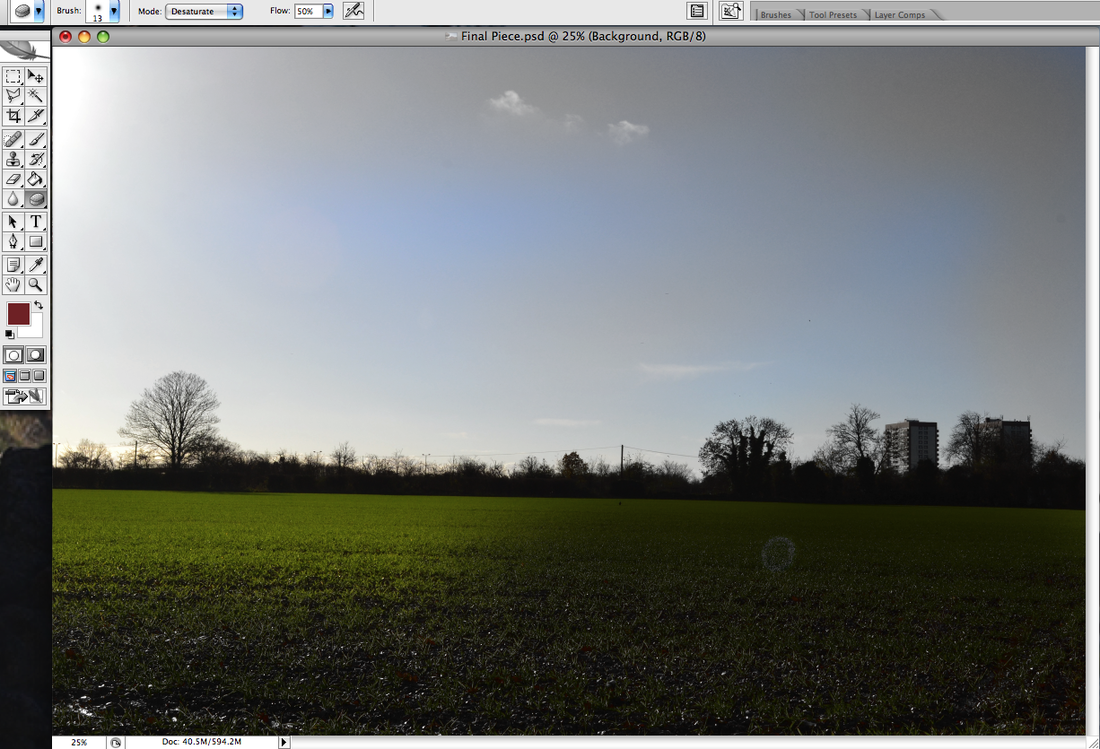
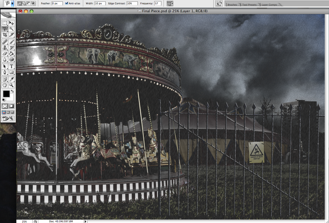
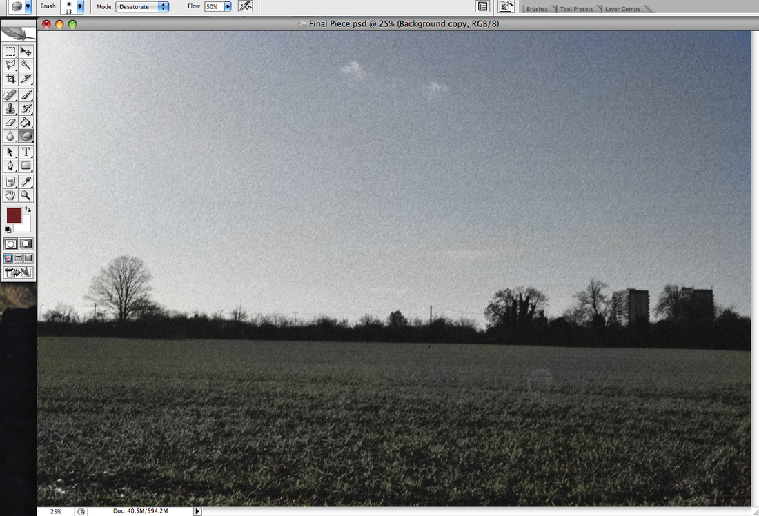
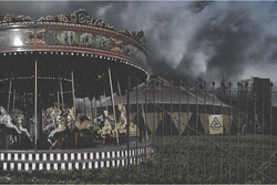
For my final piece, I planned on having a circus tent in the centre, a merry-go-round behind the circus on the left, and a few council blocks on the right in the background to make it look like something realistic. After taking all of the photos, I realised that the merry-go-round was the most interesting thing in the picture, and so I should try and draw more attention towards it. So instead, I placed the merry-go-round at the front on the left, with the tent slightly behind it in the centre, with the council blocks still on the right in the background. Also, by doing this I am creating a more interesting composition.
|
|
Mauren Brodbeck- Artist Research
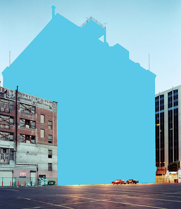
This photograph is of a blue building, surrounded by two other buildings. The building on the left looks quite run down and poor, whereas the other looks slightly better of. There is a car park infront of the buildings, with two cars parked there. The colour of the building in the middle has been changed to blue. It is quite a bold blue, but since the sky is a similar shade of blue, it stands out less. This photo creates a calm relaxed feeling, as the colour blue connotes peace. I think this photo uses use of lines as the top of the two buildings on the edge of the frame |
Biography
Mauren Brodbeck was born in 1974, in Geneva, Switzerland and trained in visual arts. As well as photography, she studied cinematography and made a few short films. She is currently a photographer represented by galleries in Switzerland, France and Germany.
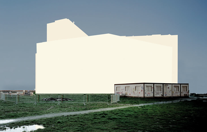
This photograph is of a building behind another smaller building, on grass. The colour of the building had been changed to yellow.
It is very bold, as the yellow colour is all mainly the same shade, and takes up a lot of space in the photo. The shot has been composed so that the yellow building is central in the photo. The photo has a gloomy depressing feel to it, I think this is because of the dull colours used. 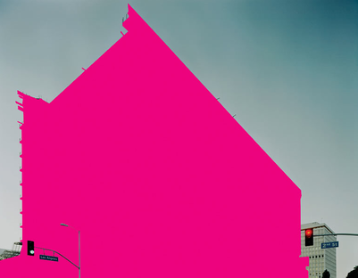
This photograph is of a big pink building with another building behind it, and traffic lights. The colour of the biggest building has been changed to a very bold bright pink, which makes it look quite feminin, as the connotations of pink are girly and feminin. This photo has been composed so that most of the frame is taken up by the pink building, but not so much so that you can still see the smaller building behind, and the two traffic lights and street signs. I think this photo is spontaneous because the pink building stands out very much, and you don't expect to see it there. |
To make my photos in the style of Mauren Brodbeck, I used photoshop. I used the polygonal tool to highlight the sections of the photo I wanted to change, then painted it a redish colour, which I chose as I wanted it similar to the tree on the right. Then to add the shade, I made a layer where the red's opacity is less, so I could see the outline of which areas would be darker and lighter. Then I painted in the lighter parts a lighter red, and the darker parts a darker red. I also had to spend a lot of time going around the bush in the bottom left corner, as there are lots of different parts to go around.
Diane Arbus -Photographer Research
Diane Arbus (1923-1971) was an American photographer and writer, but was better known for her photography. Her most famous work comes from a group of photographs called 'Deviant and Marginal People', referring to dwarfs, transgender people, circus performers and giants. She became known as 'the photographer of freaks', simply because her photos showed people that were different from the rest of society. She committed suicide, aged 48 after experiencing depressive episodes. I chose to study her, as her work links with my theme, 'that's entertainment' very well. I plan on having one of my photos of a circus tent, looking very intimidating and depressing. This works well as a lot of her photos are of people that are different, which are sometimes the kind of things that you find in a circus. Arbus's photos could maybe scare children, and I plan on my photo showing the scary side of a circus, which will reflect how some children feel towards them. Her photos influence me as I like the way she had taken photos of what most people try not to look at, and make the audience almost sympathise for the subjects.
|
Slideshow
|
Evaluating a Photographer's Work
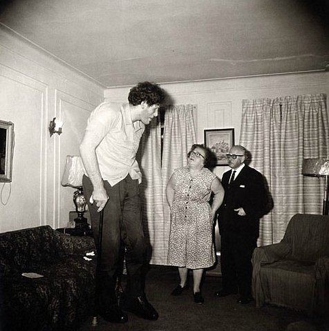
This photograph is of a man with an abnormality, which clearly is that he is much taller and bigger than most people. He is standing up in a room, with his parents on the side looking up at him. It was taken in what looks like a family home, as there are pictures on the wall, and the room looks quite cosy, and his parents are there. I think it might have been taken in the 1930's or 1940's, as the fashion seems typical of that time. I think this photograph represents how hard it is for people with extreme abnormalities to live normal lives, and how they might try to hide away from the rest of society. This could be because the photograph is taken at an angle that makes him look like he is standing is a corner, at the very edge of the room. Also because you can see the floor and ceiling, I think it emphasises and exaggerates how big he is, by showing he can barely fit in an average sized room, and is crouching down with a cane because of it. His mother looks up at him, whilst his dad looks quite awkward, as if he is trying to avoid eye contact, maybe because he is ashamed or embarrassed of his son, which could be how a lot of people react towards people with abnormalities. The photograph is from Diane Arbus's 'Deviant and Marginal People' work, so I think this idea might have been based on circus people, as well as the obvious, giants. This is because people might pay a lot of money to see someone so big, which would make the person feel like a 'freak', like they belong in a circus.
The photo is completely in black and white, which is only because of the time it was taken in. However, I think the grey in the photograph connotes how gloomy that time was, and maybe how the 'giant' man feels, and that he is tired of being a 'freak'. The corners of the photos are black and slightly blurred. I think this is done because it makes it seem like a spot light is one him, which is maybe what would happen at the circus, or shows how much unwanted attention he gets. I don't think any of the rules of composition are obvious, although the black at the corners makes it look like the photograph is framed by a circular object. I think this photograph is very spontaneous as nothing looks too planned out, and nothing looks like it really needed planning out as there isn't anything to difficult to photograph. By both of his parents looking towards him, your attention is drawn to him, as well as the fact that his body takes up a lot of the room in the photograph. There are quite a few different patterns in the photograph, like on her dress, the furniture and the curtains, which I think just reflects the fashion of that time.
The photograph was taken inside, which makes it difficult to tell what time of day it is as the curtains are drawn. However, the curtains might be drawn because it is late so it might be dark outside. The room seems to be lit by the lamps in the room, or behind the camera, focusing more on the tall man. Although there are many different light/lamps in the room, I can only make out that the light behind the main subject is on, which draws attention to him. Because it is such a small light, I think there was probably more light, but behind the camera. I don't think that the photograph has been manipulated or distorted in any way. Also I don't think that Diane Arbus would manipulate very much, as she said that her aim was to capture the 'truth'.
This photograph makes me feel quite gloomy and depressed. I think this because of all the murky lighting and black and white colours, as well as the fact that it is taken of a man with abnormalities. This creates sympathy for him, and almost puts you in his shoes. The theme of the photograph, being 'circus freaks' definitely makes you sympathise for the subjects, and gives you an insight on how they live, and what reactions they get, and how they try to hide away. This shows their abnormality affects their whole lives, even though its probably not their fault they are the way they are, which would get sympathy from most people. Also, most people would look away and try not to stare at people with abnormalities, but if its in a photograph you are almost forced and allowed to look, which makes you understand more about them, and what they go through.
Eugene Atget -Photographer Research
Eugene Atget (1857-1927) was French photographer known for his work documenting Paris. He became a photographer when he turned 30. Before a photographer, he tried many different things, like being a sailor, actor and painter, but all were unsuccessful.
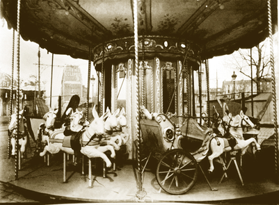
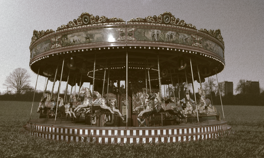
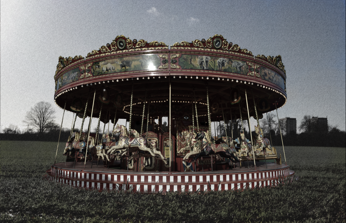
This photo is taken of a merry-go-round fair ride. It looks like it was taken in autumn or winter, as there are no leaves on the tree in the background on the right, and the sky is very white which makes me think it was taken in the morning. I think the photograph communicates a message that says while the weather and everything is gloomy, children can always have fun on a merry-go-round. I think this as there is a great contrast between the different shades of black on the merry-go-round compared to the empty white sky. It looks like is was lit from the white sky, and maybe a light behind the camera to the left, as the horses on the left look brighter than those on the right. I think the photograph creates a mundane feel, even though it is focused on a merry-go-round which normally connotes fun and excitement. I think this as although the frame is mainly filled with the merry-go-round, the contrast between the sky and what is in the foreground is so great, that my attention is also drawn to the background. The background looks very dull and depressing, which is why I feel it creates a mundane mood, as well as the fact that the merry-go-round is empty, whereas if it had had children playing on it, it may have created a much happier mood.
|
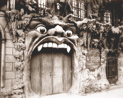
This photo is taken of what looks like a wooden door, with a creatures mouth as the door. There are old windows and decoration on the rest of the building, making it look sinister and decaying. I think the message the photograph communicates is saying that whatever is inside the building is evil, and you should only enter if brave. The photograph is in black and white, but only because of the time it was taken in. However, I think it makes it look more dark, strange and hidden, as you cannot see what's through the windows. Because of the contrast between the white teeth and the rest of the photo, your eye is drawn towards the teeth, which emphasises how shape they are, which makes the creature look more dangerous. The building looks like it is lit from natural daylight, whereas the inside of the building is not lit at all, making it look mysterious.
|
Eugene Atget & Diane Arbus
Both photographers relate to my theme, 'that's entertainment', but in different ways. Diane Arbus shows more of a depressing side of a circus, focusing on people who are different, and are called 'freaks', whereas Eugene Atget shows more of the fun things that create excitement. Although both are very different, looking at their work has inspired me and given me more ideas for my final piece. I plan to include some of the more dark sides of a circus, which was explored more by looking at Diane Arbus's work.
My work in Eugene Atget's Style
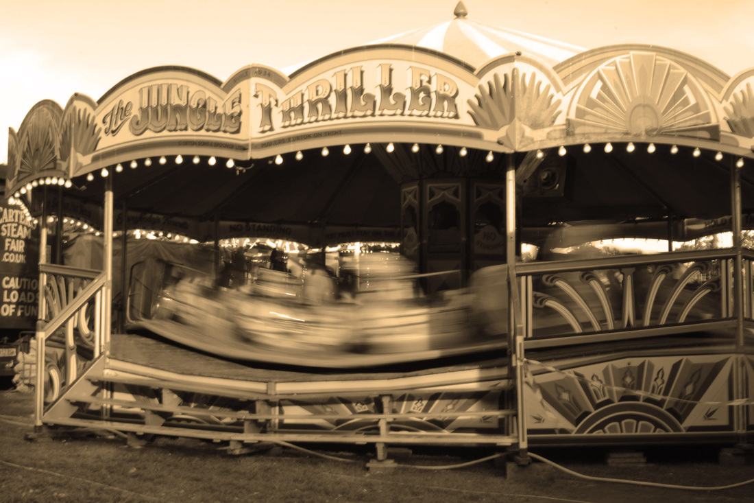
This is my artist replication of Eugene Atget's work. Looking through his photos, I think they look like the effect, sepia. When doing my own artist replication, I decided to use my steam fair photos, as they look similar to the ones by Atget. Then on photoshop, I made the first two monochrome, then put the photo effect, 'sepia' on them. I like this effect a lot, and think by giving the photos an yellowish tint it makes them look a lot older. I like the top right one best, as I think the way I captured the movement by using a slow shutter speed well, and that makes the photo look more interesting. I also think by capturing the movement it represents how alive a fun fair is, and how exciting the rides can be. This contrasts with Atget style, as it looks very old fashioned ad simple.
|
|
Will Pearson- Rule Of Thirds
Biography
Will Pearson (born in 1983) grew up in the Peak District, Derbyshire, and headed to London after graduating from university. Will is a professional panoramic photographer, and has been since the mid-nineties.
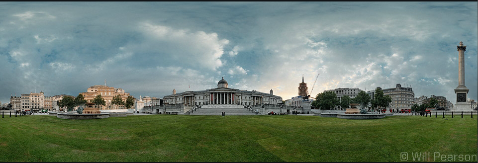
This photo also uses the rule of thirds. I think it is used horizontally; the first third is of the grass, then the next of the buildings, and the third just where the tallest building ends and the sky starts. This brings your attention to the buildings, which only takes one third of the photo. The rest is grass and the sky. Normally the buildings would be the main subject in the photo, but this photo isn't like that and so it is more interesting.
|
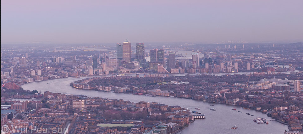
In this photo, Will Pearson uses the rule of thirds very well. Vertically, I think the rule of thirds is very clear. One where the buildings end, and one where the cliff starts. Also, I think this because where the bridge meets the sky, is slightly less than a third of the photo, which exaggerate just how big the sky is, and plays with the rule of thirds. The left third of the photo is of buildings, and the right is plants and what looks like a cliff, this makes it look like two completely different photos which are joined together by the bridge.
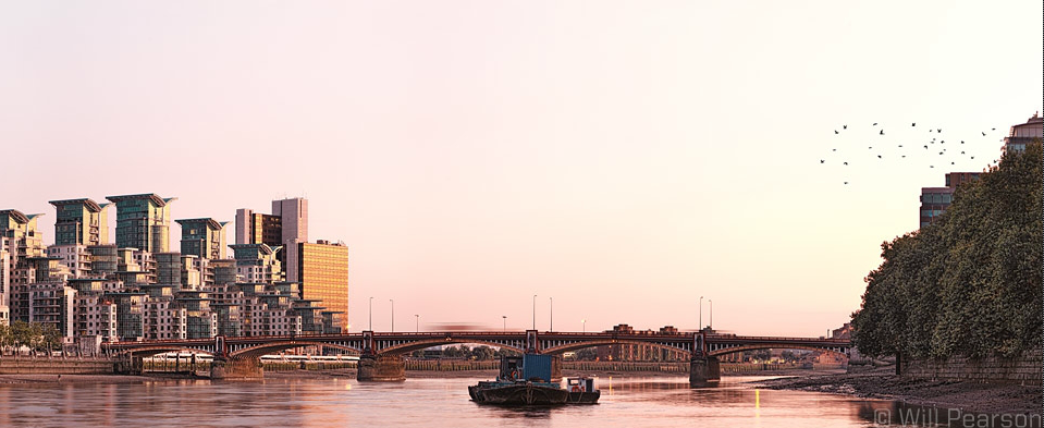
I think this photo uses rule of thirds horizontally. I think the river separates the first and second third, and the third is just where the land ends, and the sky starts. In the background it the sea, or whatever the river leads into. This exaggerates how long and wide the river is, and how it travels through the city separating it into two halves.
|
AO2 Creative Making
'Experiment with and select appropriate resources, media, materials, techniques and processes, reviewing and refining ideas as work develops'
Experimentation
|
|
|
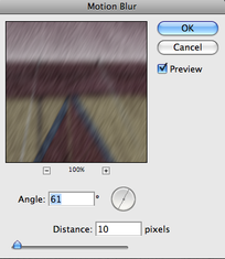
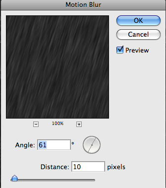
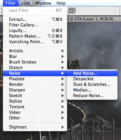
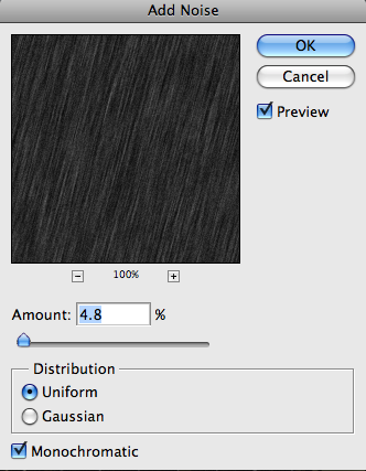
For this experimentation, the main thing I wanted to do was practice adding rain over photos, that I have taken when it wasn't raining. Each of the photos are different photos photoshopped onto different backgrounds. Then I added 'noise', and used motion blur to make the noise look at an angle as if it were raining. I think this worked quite well, and looks like rain which was useful practice for the final piece, and seeing if it would look realistic.
Introduction
DSLR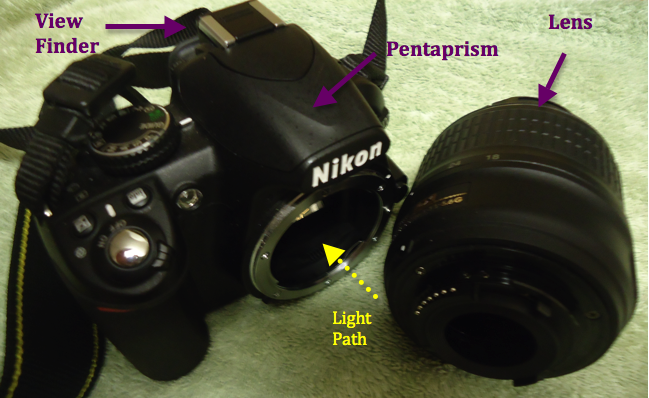
DSLR- Digital Single Lens Reflex DSLRs have an attachable lens, with a manual zoom. The light travels in through the lens, and is reflected upwards by a mirror, where it is reflected by another mirror and into the view finder, then into your eye. When the shutter button in pressed, the mirror moves out of the way, and hits the sensor behind it. Aperture
Aperture-Controls the amount of light going through the lens. Aperture is measured in 'f-stops'. f/1.4- lets in a lot of light f/16- doesn't let in a lot of light ShutterShutter-Lets light into the camera, and determines how long the light exposes the film or light sensors.
1/4000-Lets a small amount of light in, and is a very fast shutter speed. 1/25- Lets in more light, and is quite a slow shutter speed, which means you could get camera jog. If the shutter is left open for too long, the image can become over exposed as there is too much light. Whereas, if the shutter is not open for long enough, the image can be too dark as there is not enough time for light to come through the shutter. Also, a long shutter speed allows you to take photos even in poor lighting. However, the camera must be very still, so on a tripod would be best.
|
Compact
A compact camera, is a camera where the lens is attached, and is normally smaller than a DSLR. Depth of Field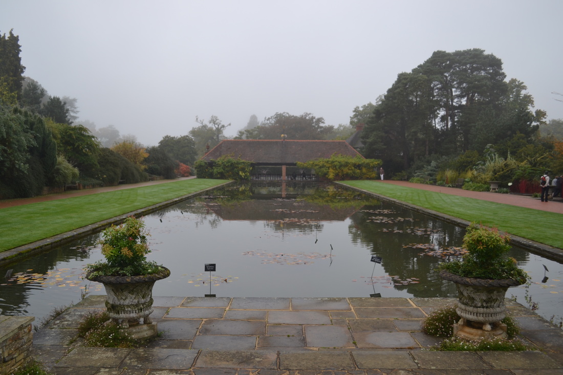
Depth of field is set by the aperture.
A narrow/shallow depth of field, means there's less in focus. A large/great depth of field means there is more in focus. This photo has a great depth of field, as most of is is clear. Panning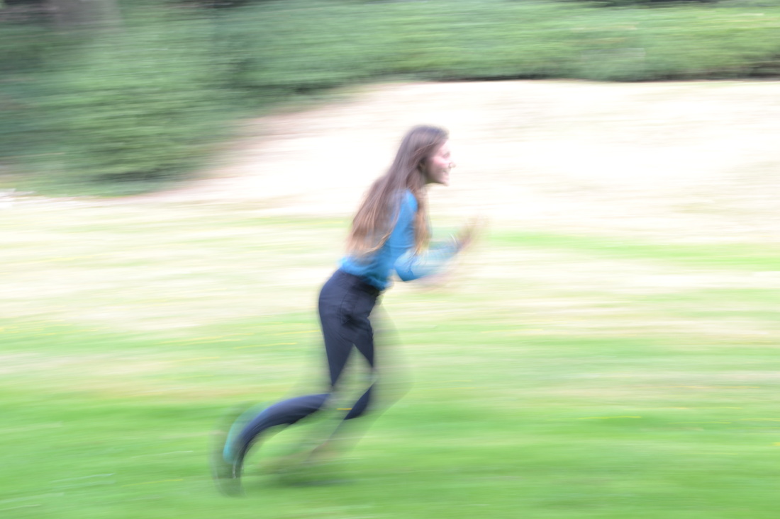
Panning- technique used for action shots, which gives the impression of movement. Panning makes the moving subject sharp, but the background blurred.
-To pan you must use a low shutter speed, to capture the movement and follow the subject. |
Six Rules of Photography Composition
Filling the FrameFilling the frame is when you fill the frame with your subject, making it draw your attention. It is a way to focus on the main subject, as well as keeping out unwanted distractions.
Vantage PointVantage point is a way of making a photograph more interesting. It is done by taking the photo at a drastically different angle (vantage point), like crouching down on the ground, or climbing something for a higher angle.
Use of LineUse of lines is when a photo includes lines, which helps lead the eye through a photograph, and are used to suggest a mood. A horizontal line adds stillness and balance, a vertical line adds stability and tranquility and a diagonal line adds movement and action. The lines should point to the most important object, so it draws your attention there.
|
Framing the SubjectFraming the subject is a way to draw attention around the subject, and compose the photo using natural or man made frames. Also, using a frame that links to the subject adds interest for the viewer.
Depth of FieldDepth of field is how much of the photograph is in focus. If a photo has narrow depth of field, it means only a small amount of the photo is in focus. Whereas, if the photo had a large depth of field, that would mean that a large amount of the photo is in focus.
Rule of ThirdsRule of thirds is a guideline you can use when composing a photo. The photo divides into thirds horizontally and vertically, and you try to align parts of the photo within the thirds. Using rule of thirds, it adds a lot more interest to the photo, and can make it much more aesthetically pleasing.
|
Using AE-L (Automatic Exposure-Lock)
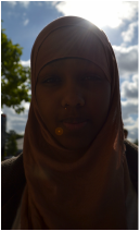
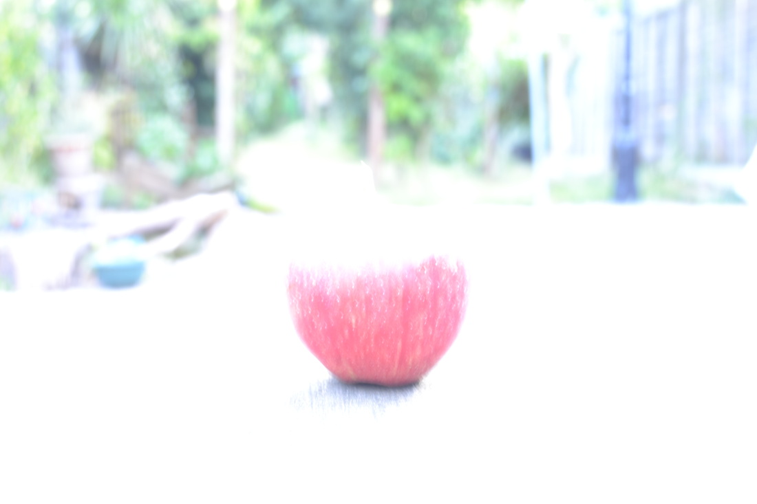
This photo was taken before using AE-L. It measures the centre weight, and because the sun is so bright, it makes the subject more darker, so it looks like more of a silhouette.
Light is the hardest part to control in any photograph, as you have to control the exposure to the sensor metering. 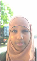
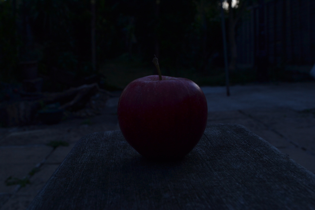
I took this photo using AE-L. I went up close to her, until just her chin was showing in the view finder. Then I pressed and held the AE-L button, taking a reading on the light meter located behind the shutter. I then moved back, and took the photo, whilst still holding the AE-L button. Her face is a lot clearer here, than in the other photograph. This is because by taking a light reading, I am controlling how much light goes to the sensor-metering, and exposing the subject correctly.
|
Flash is used when the subject is not exposed correctly. It is often used when there is not enough lighting.
|
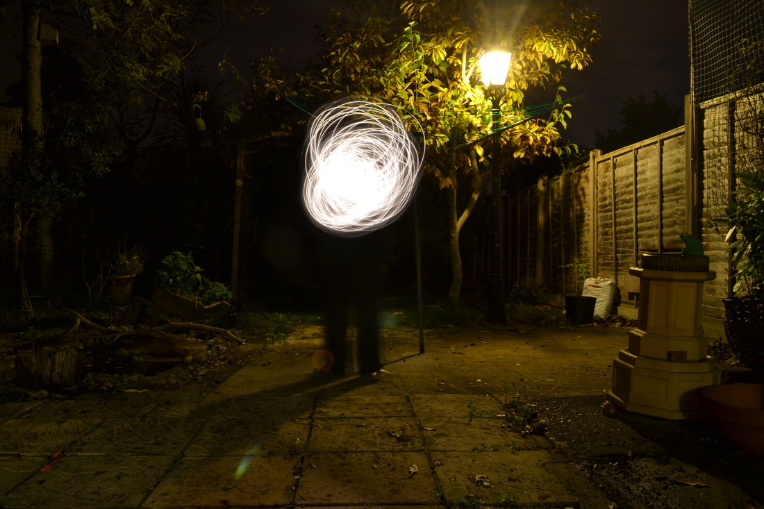
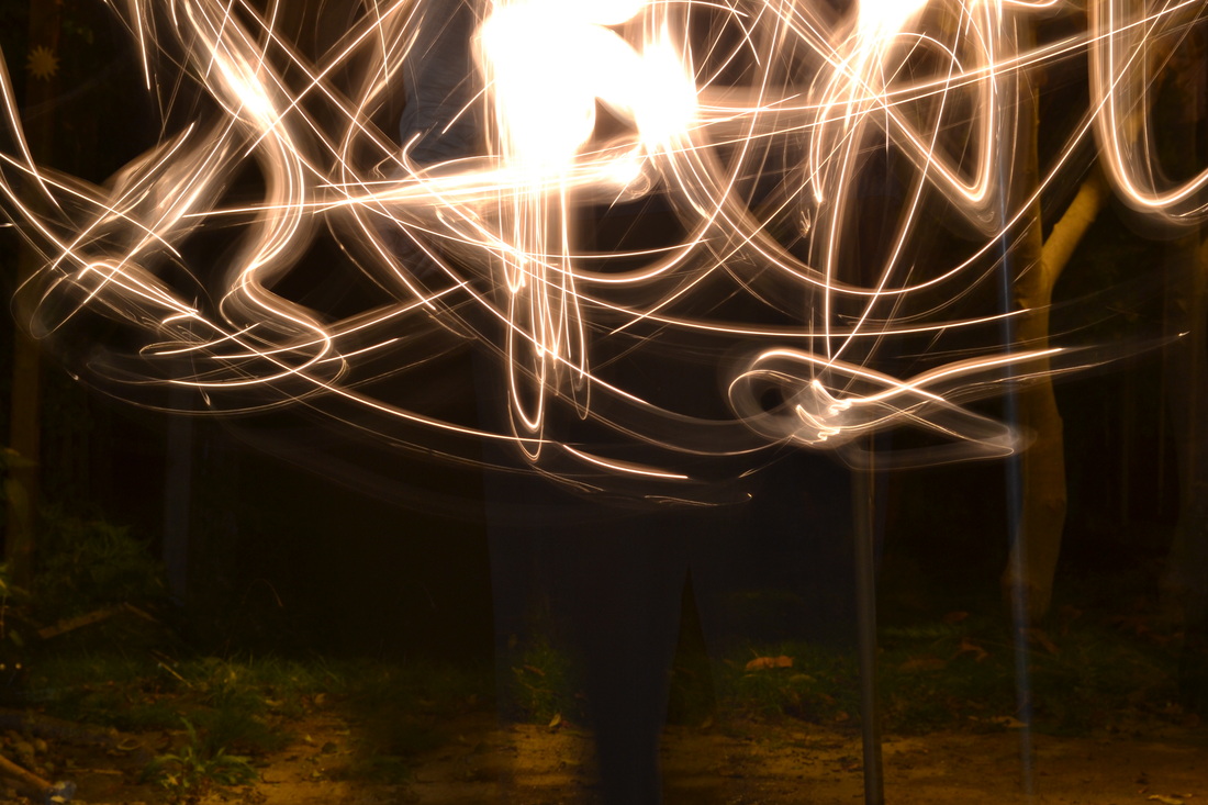
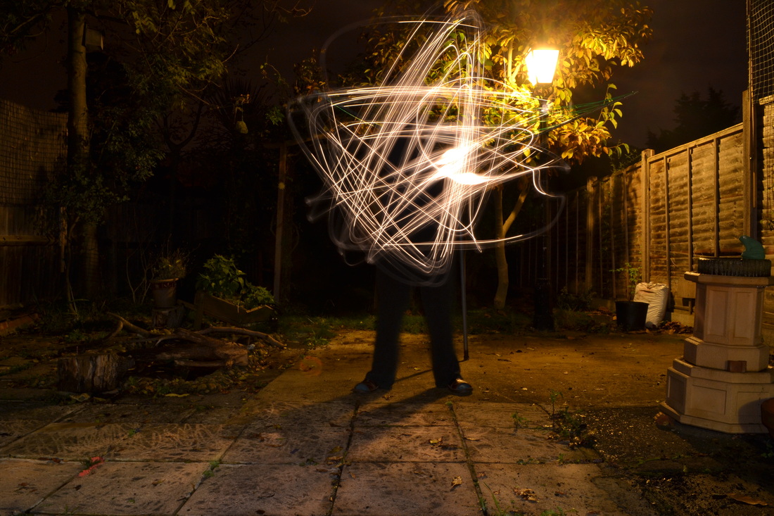
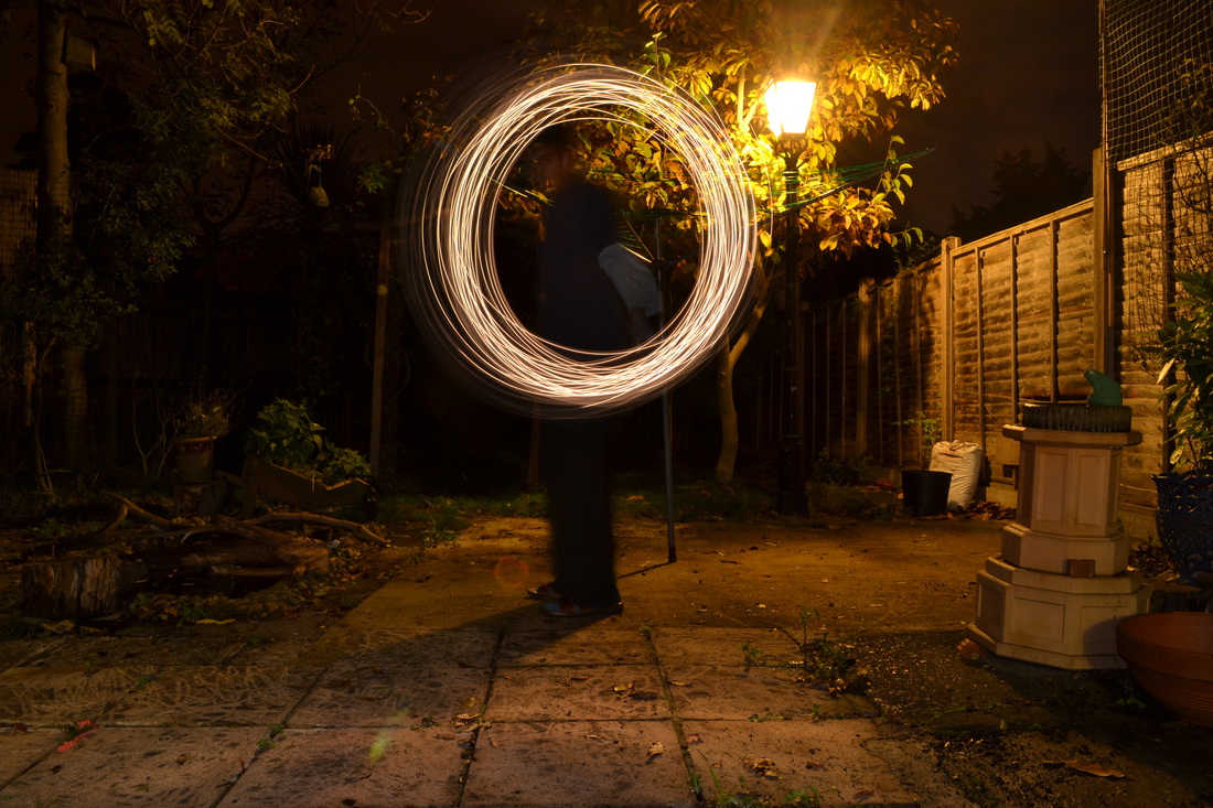
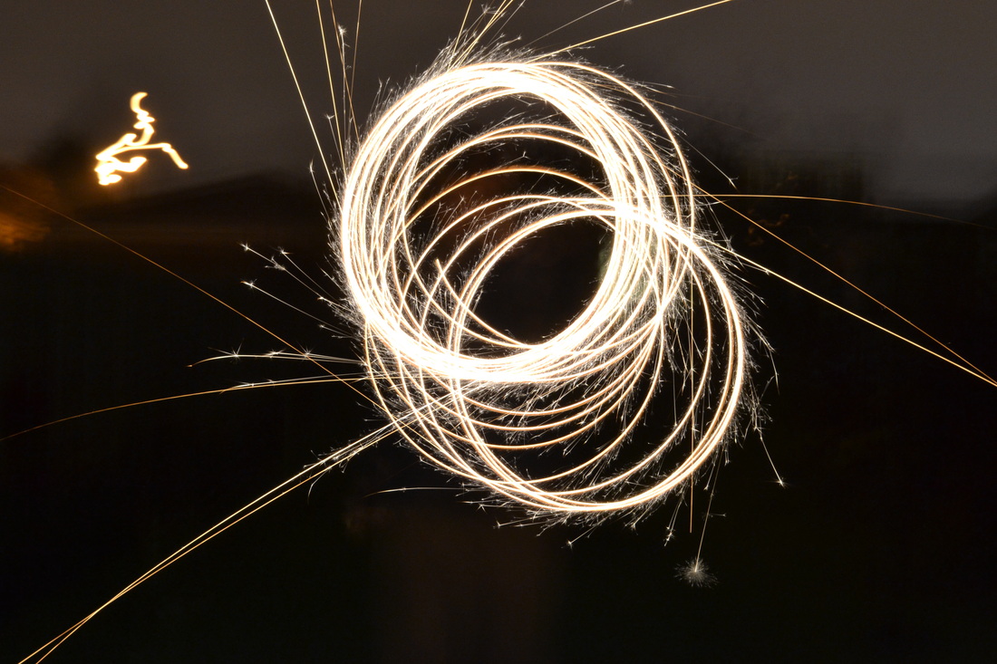
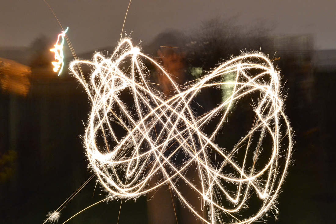
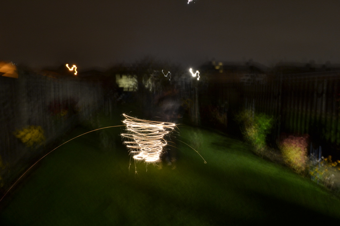
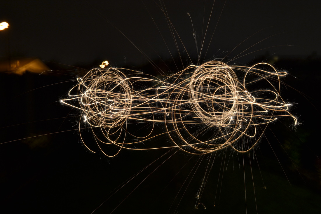
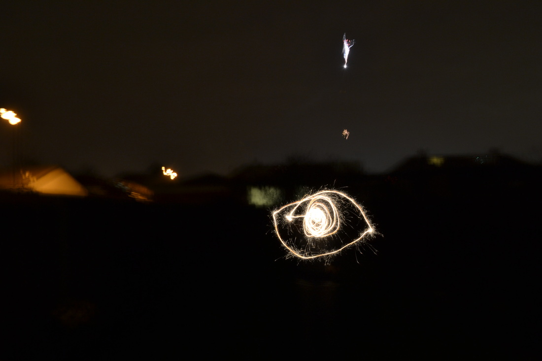
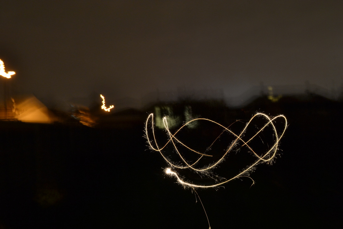
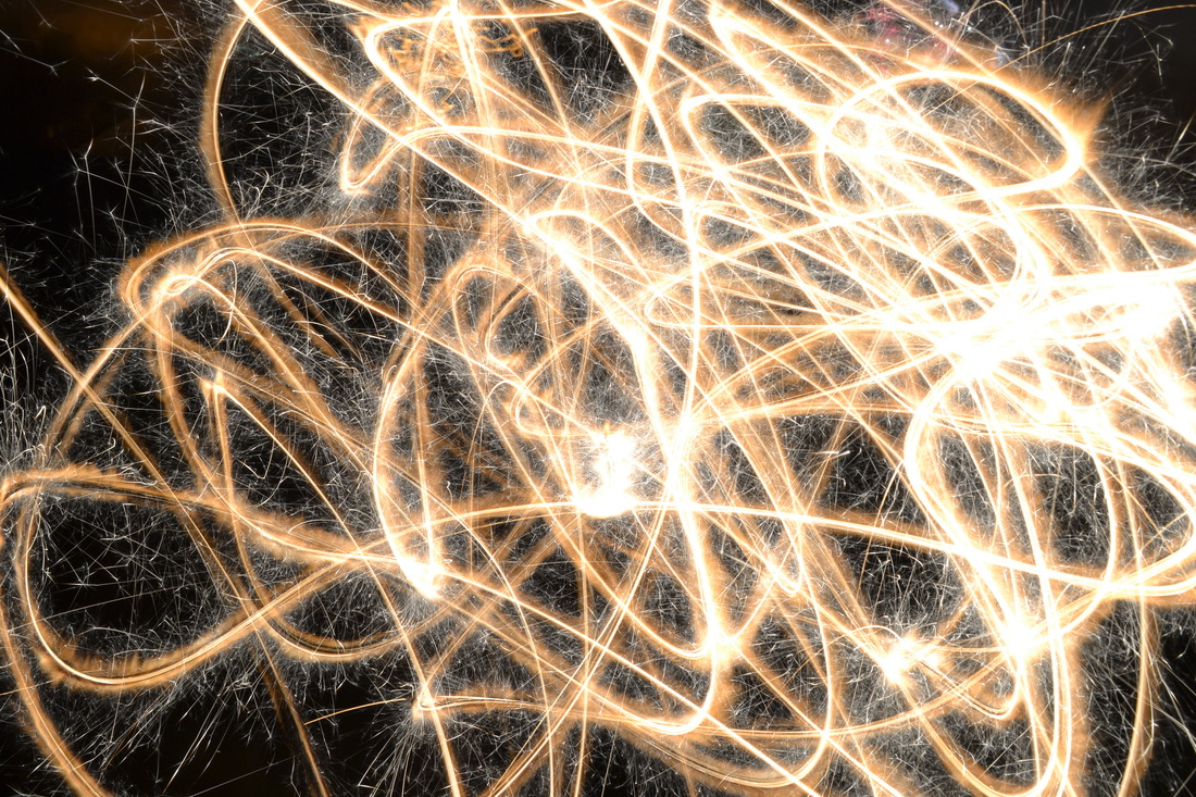
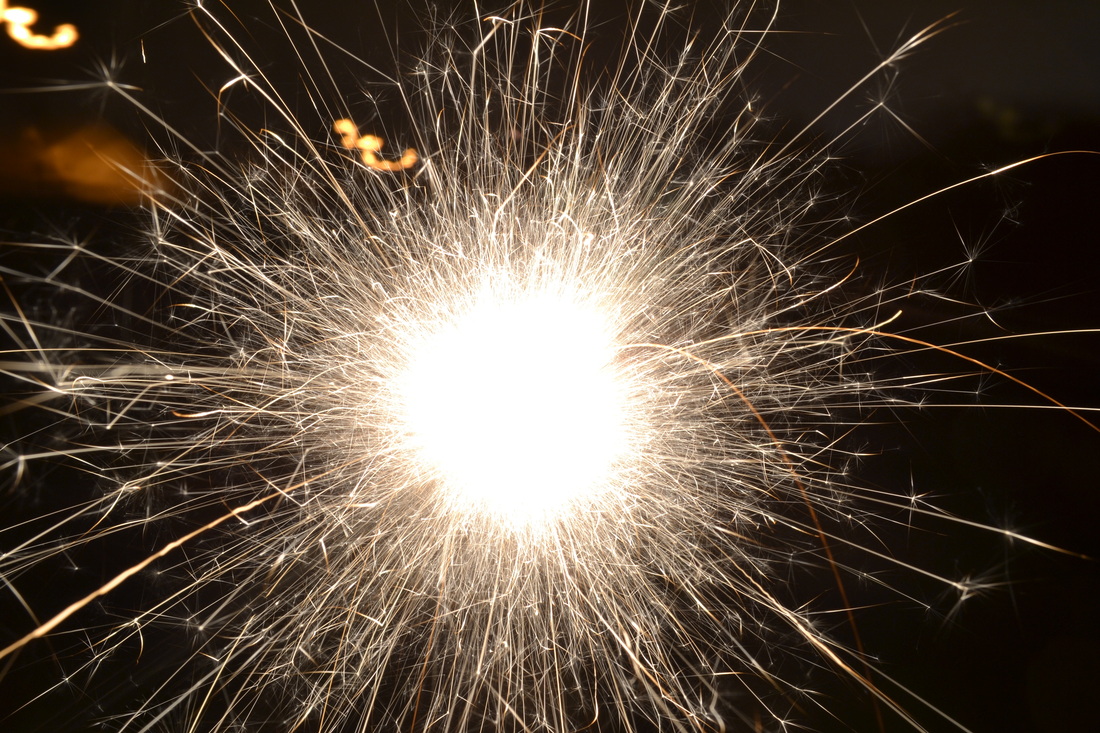
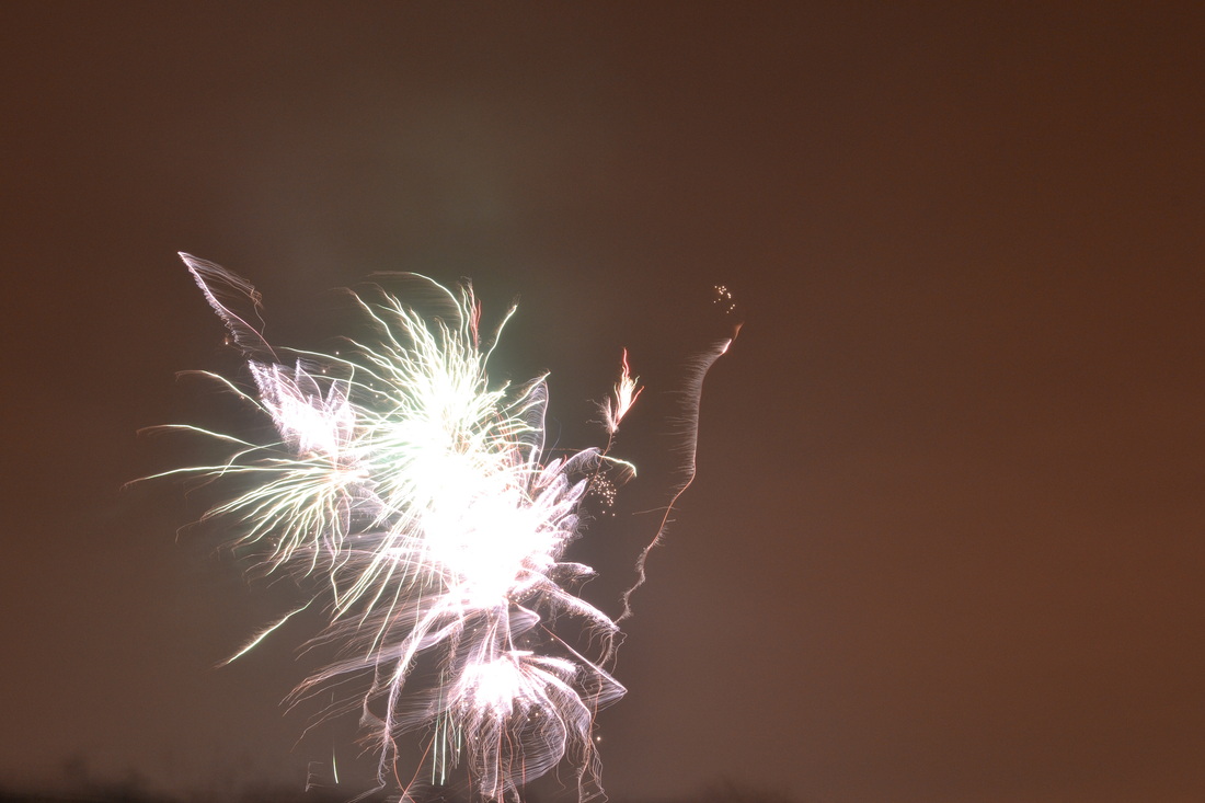
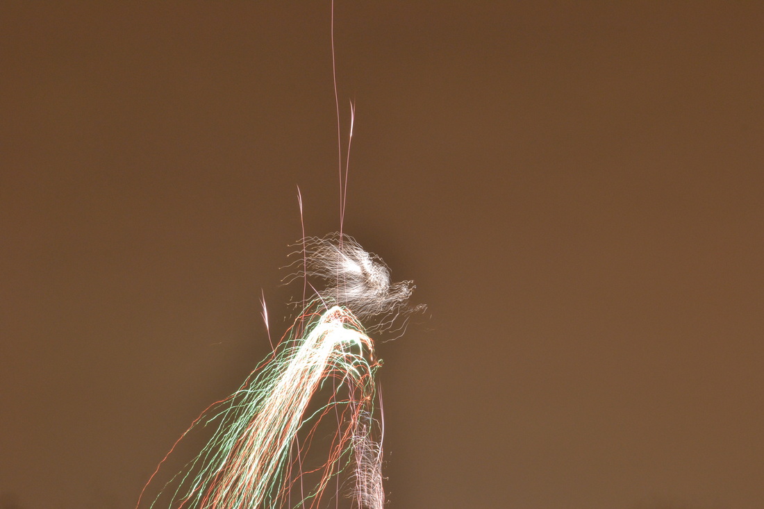
Long Exposure
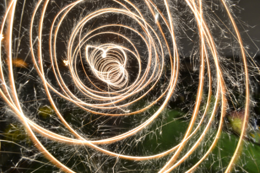
To take a photo using long exposure, you have to ensure that the camera is set to a long shutter speed to capture all of the movement and let in enough light, put it on self-timer so that you can avoid camera jog, also use a tripod to avoid camera jog, and have a light source. This makes the camera record where the light moves in focus, whilst the shutter is open, and so you see everywhere the light moved clearly.

Long Exposure-Richmond Photo shoot
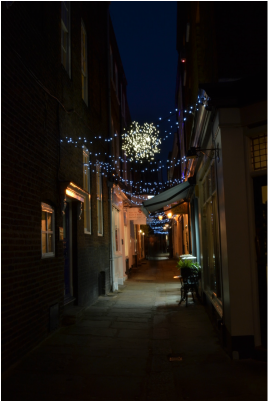
I took this photo a the start of an alley way with shops along the sides. I like the edges of the photo because they're dark, whereas the middle of the photo is lit up. I also like this photo because of the use of line, like where the ground and walls meet, so that your eye follows down the alley way. For this photo the shutter speed was 5.6, and the aperture was f25. 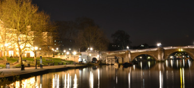
I like this photo because the lights in the buildings contrast with the dark sky and water. I also like the reflection of lights into the water. The buildings in the background add more depth to the photo. The aperture was f8 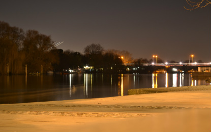
I like this photo because you can see how to bridge connects the ground the photo was taken on, and the trees across the river. I also like how the lights on the bridge reflect in the water. If I were to take the photo again, I would face the camera slightly more to the right, so that you can see all of the edge of the ground until the bridge comes in. The aperture was f5.6
|
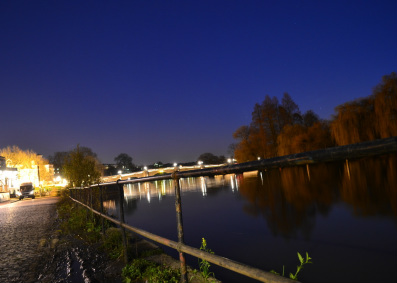
I like the sky in this photo as it looks quite bright, and is a lot lighter than it actually was at the time. I also like the fact that you can see the reflection of the bridge in the water, which is lit up by the cars. I like the angle this photo was taken at, as your eye follows the railing, however if I were to take it again, I would put the camera higher, so that you could see the bridge clearly, so that it wasn't blocked by the railings. This photo uses rule of thirds, as the trees, bridge and building separate the photo into thirds. The aperture was f3.5 and the shutter speed was 
This photo is very similar to the one on the left, however I like the lighter sky in this one, as you can see a white light in it that looks a bit like the moon. I also like the contrast between the lights in the bottom half of the photo, and the more clear sky. The aperture was at f5.6
|
ISO
ISO is the sensitivity of the film, and how much light is needed to expose the film. It used to be called the 'speed of film'. We describe the ISO by saying either 'grain', 'lossy', 'noise' or 'resolution'. All of these words mean similar things, however 'grain' and 'resolution' are used to describe how fine the photo is, and 'lossy' and 'noise' are how blurred the photo is. The ISO at 1600 is what is normally used for newspaper images, or sport photography, as there is a lot of light so theres a quick shutter speed. The photos come out grainy. However, when the ISO is at 60, a lot of light is needed but the photos come out with no so much grain, so you get a better photo with a higher resolution.
Exposure Compensation
+_ _ _ _ _ _ _ _ _ _|_ _ _ _ _ _ _ _ _ _ -
Photo is brighter Photo is darker
Exposure Compensation is used when there is bad lighting conditions, or to bring out certain colours.
Photo is brighter Photo is darker
Exposure Compensation is used when there is bad lighting conditions, or to bring out certain colours.
Program Modes
Program Mode
Camera calculates shutter speed and aperture
Night Portrait Mode
Used for low lighting, like night time, uses flash for exposure Portrait Mode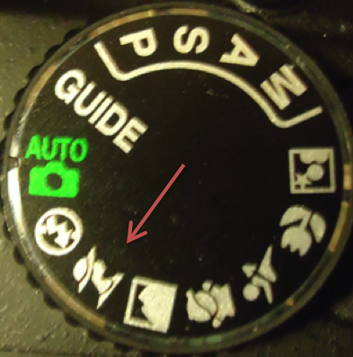
Focuses on the foreground, and uses shallow depth of field
|
Shutter Priority Mode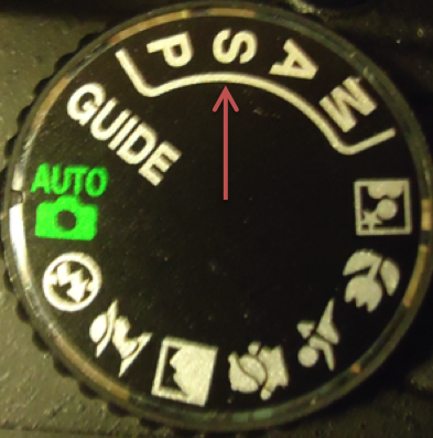
Control shutter speed manually, and camera controls aperture
Macro Mode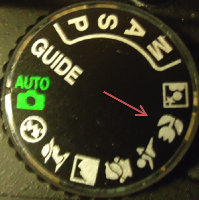
For close ups, so it's able to focus very closely on the subject No-Flash Mode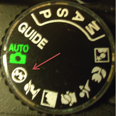
Use when you aren't allowed to use flash, or don't need flash |
Aperture Priority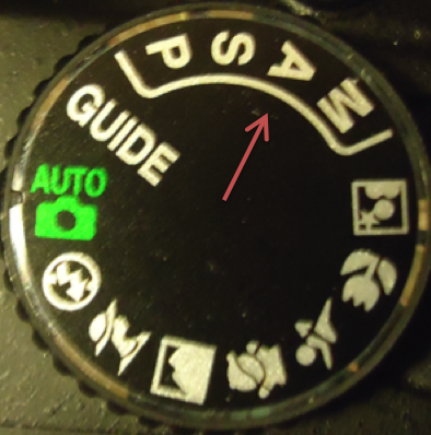
Control aperture manually, and camera controls shutter speed
Sports Mode
Quick shutter speed so it's good for capturing movement
Automatic Mode
The sets everything for you
|
Manual Mode
Control both aperture and shutter speed manually
Landscape Mode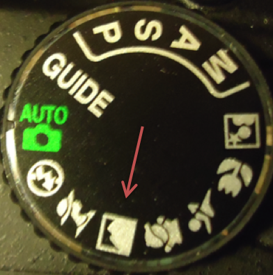
Large depth of field so everything in the landscape is in focus Guide Mode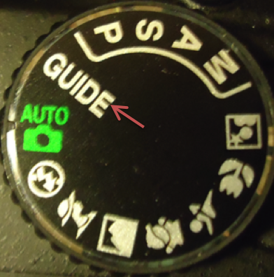
Camera guides you through the different modes, with instructions
|
AO3 Reflective Recording
'Record in visual and/or other forms ideas, observations, and insights relevant to intentions demonstrating an ability to reflect on work and progress'
Steam Fair Photoshoot
Location: White Waltham Berkshire
I went to the fair after finding out about it online, and saw that it was old fashioned, and much like a fun fair. For my final piece I need a merry-go-round, and I knew they would have one here. Also I thought it would be good inspiration for my 'that's entertainment' theme.
Camden Photoshoot
Location: Stables Yard, Camden
I went to Camden as I have been there before and knew that part of it is in an old stable, where there are lots of horse statues. I thought this would be useful as on the 'merry-go-round' I was planning on having some horses trying to escape from it, however I then changed the idea.
Buckingham Palace Photoshoot
Location: Buckingham Palace
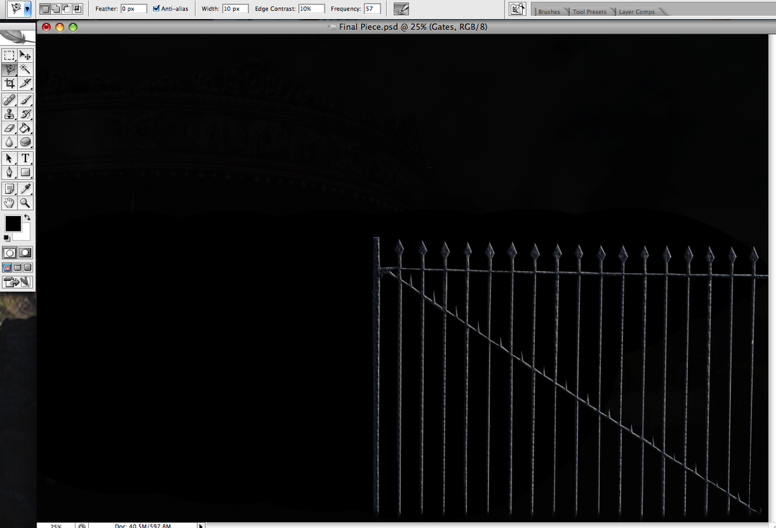
I went here as in front of the circus I plan on having a gate surrounding it, showing it is dangerous. However, I am not going to use these gates as they are too elegant.
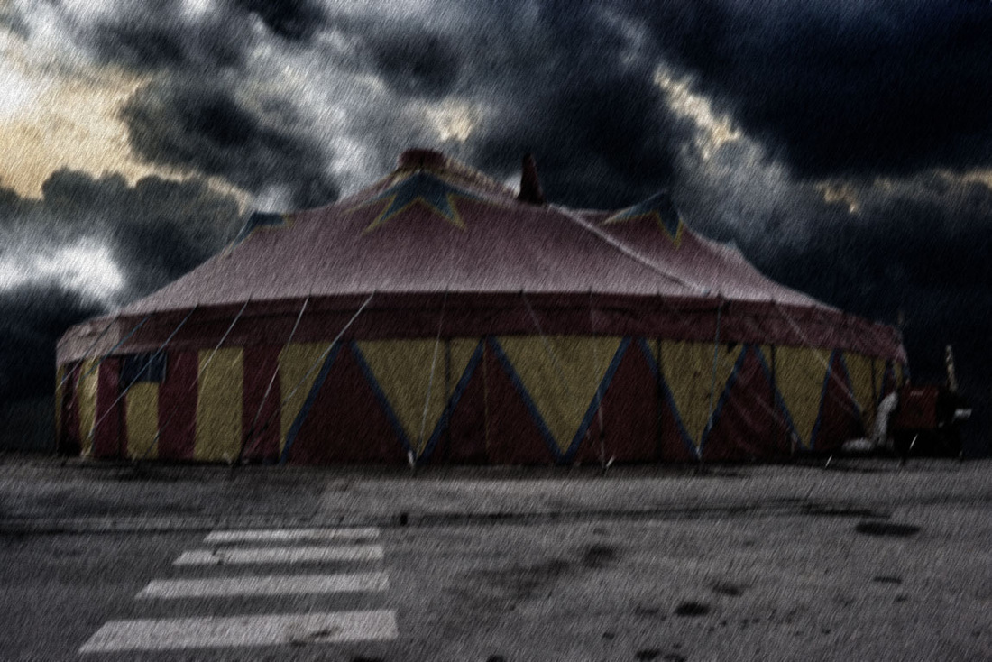
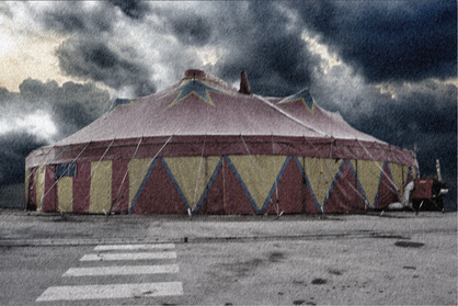
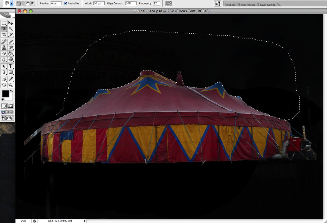
Circus Tent Photoshoot
Location: Wembley
I researched the circus online, and saw that the actual tent was quite close to what I wanted in my final piece. I only needed photos of the outside of the tent, however I could only really take photos from one angle to fit the whole tent in the frame. I found out about the circus a day before, so the day I went for the photoshoot was the last day, so I couldn't see it open.
AO4 Personal Presentation
'Present a personal, informed and meaningful response demonstrating critical understanding, realising intentions and, where appropriate, making connections between visual, written, oral or other elements'
Final Piece
Process
|
|
|
|
Evaluation
I feel I have learnt a lot throughout the course of the landscape unit. One thing that went well was planning my final piece, and having a clear image in mind of how I want it to look. The idea sheets really helped, as did the brainstorm I started with. I chose a few themes from the brainstorm and combined them to come up with the circus. If I were to do the landscape unit again, I would probably decide to do more than one final piece. This is because trying to put so many different objects into one final piece proved difficult, and so if I done it again, maybe I would have separate final pieces with a few things to do with a circus in them each. I think my photography skills have developed by using photoshop. I have learnt many things, for example, making it look like it's raining when it isn't, layering images over each other so that they look like their in the same place, and how to take landscape photos where everything is in focus. When planning out my final piece, my idea developed and changed a lot, but I think it looks like how I planned out in the end.
