What are the aesthetic affects of colour in photography?
Multiple Colour Photos |
Single Colour Photos |
Jamie Nelson
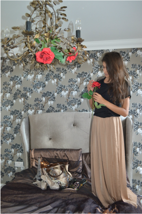
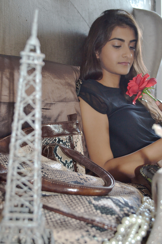
Jamie Nelson is a fashion and beauty photographer, based in New York. At the age of 17 she knew she wanted to be a fashion photographer. She has a lot of work shown in campaigns and billboards. Today she works in New York, London and areas in the middle East. I chose to look at Jamie Nelson because in all of her photos there are many different colours use. I also like a lot of the ideas used, with all the different interesting settings, and props.
|
|
|
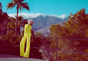
This photo is of a woman wearing a bright yellow outfit, standing on a road infront of a mountain and palm tree. The background is mainly blue and grey, with white. The yellow suit of the model really stands out, and almost could represent the sun, and it looks very sunny in the photo and bright, but you can't see the actual sun. Her hair, red lipstick and outfit make the photo look quite pin-up doll-like,
This photo also looks like the kind of photo that you would find in a fashion magazine, and I don't plan on doing fashion photography. From this photo, I would be inspired by the colours, and how the colour in the foreground stands out, from the more calm background colours. |
|
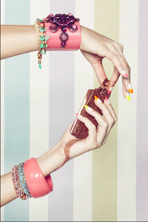
This photo is of a woman's hands holding a chocolate biscuit, wearing bracelets. The background design is like a wallpaper, with calm colours, like purple, blue and green, which are all very pale. The model wears bright vibrant coloured bracelets, which are pink, purple, green, orange and blue. This stands out very much from the background, as does the luminous colours of her nails. I like the variety of colours in the photo, and the different tones of each colour.
From this photo, I have thought more about the background colours and foreground colours. I think I might try to have the same colours in foreground and background, but with very different tones. So that the background is very pale and calm, and the foreground is very vibrant and bright, but by still using the same colours as the background. |
|
Artist Replication- Jamie Nelson
Edited Colour Versions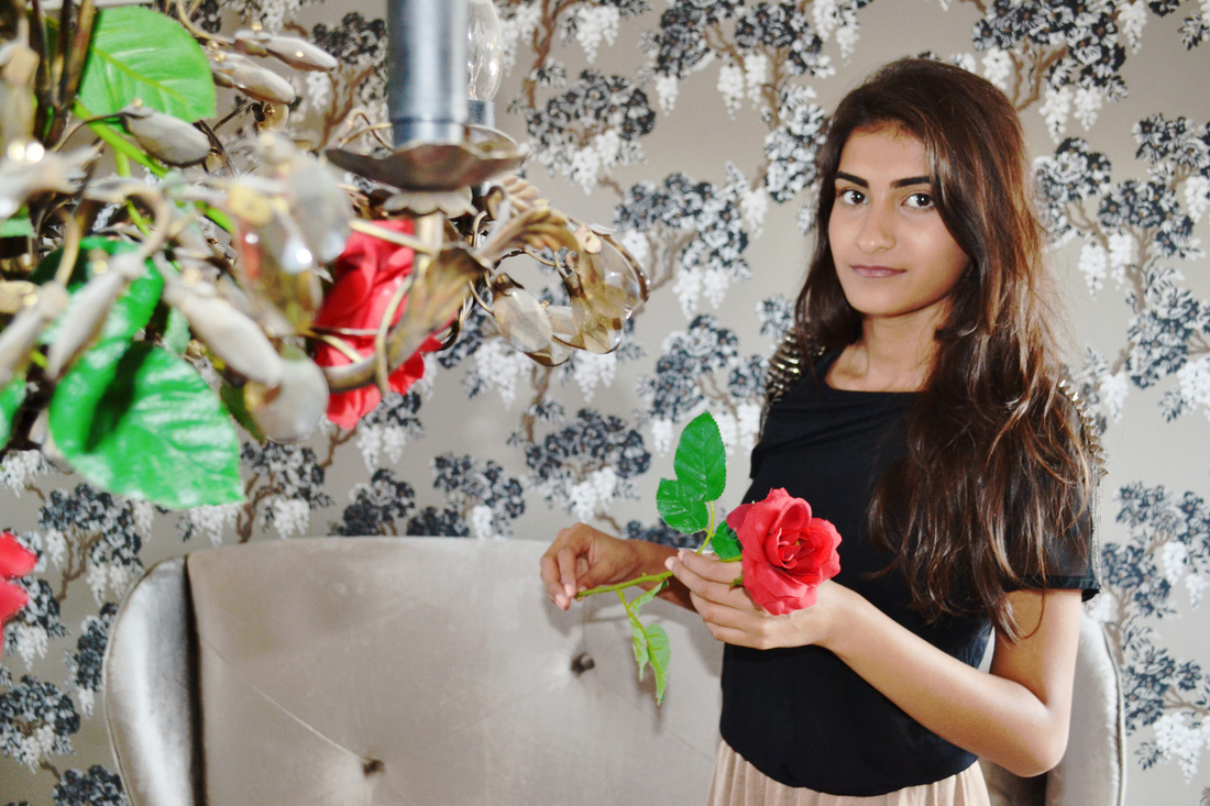
|
|
Andy Warhol- Artist Research
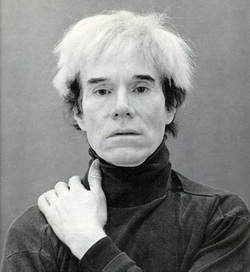
Andy Warhol (1928-1987) was an important figure in art, and is known for being the pioneer of pop-art. His most famous work was a painting of Marilyn Manroe.
|
|
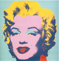
This painting is of Marilyn Monroe, and was iconic in the pop-art movement. The contrast has been edited so that all of the colours are very different, providing a lot of contrast to the photo, and making it more interesting. The painting uses four main colours. The pink of her skin, which makes her look very feminine. The red of her lips and her collar, which connotes love, lust and maybe danger. The pale blue of her eye shadow and the background create a calm relaxing tone, which contrasts a lot with the vibrant red. And the yellowish blonde of her hair, just exaggerating the fact that she is blonde and beautiful.
Artist Replication- Andy Warhol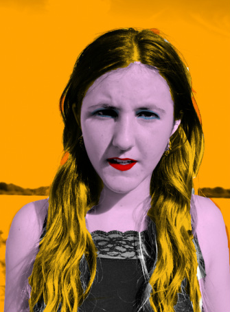
|
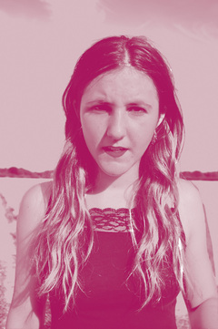
Single Colours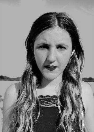
|
|
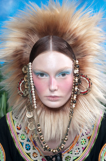
Benjamin Kanarek
Canadian born Benjamin Kanarek was initially interested in music and architecture, but had to give this up after being involved in an accident. Kanarek says he fell into photography by accident, and by his second photoshoot he was already shooting for a advertising campaign.
|
This photo is a portrait photo of the model wearing what looks like tribal clothes, starring into the camera. She is wearing very colourful clothes, with a lot of beads and fur making it look tribal. The blue of the eyeshadow and the sky creates colour patterns in the photo, as does the brown beads with the brown hair/fur. The way her face looks really simple contrasts with the busy colours and patterns of the outfit.
Looking at the photo, I think I will try to experiment more with the costume and make-up, and maybe try using cultural dress. Also I will try to fill the frame with her outfit. |
Artist Replication- Benjamin Kanarek
This photo was originally with the top purpish brown, and the skirt was blue. I edited it to make her skirt and top green, and enhanced the green in the bush behind her. I done this because now it looks more like a well-planned photo, and the model matches the background, making it look better. I think if I hadn't have editied the colours, it wouldn't be so aesthetically pleasing.
|
Edited Colour Versions
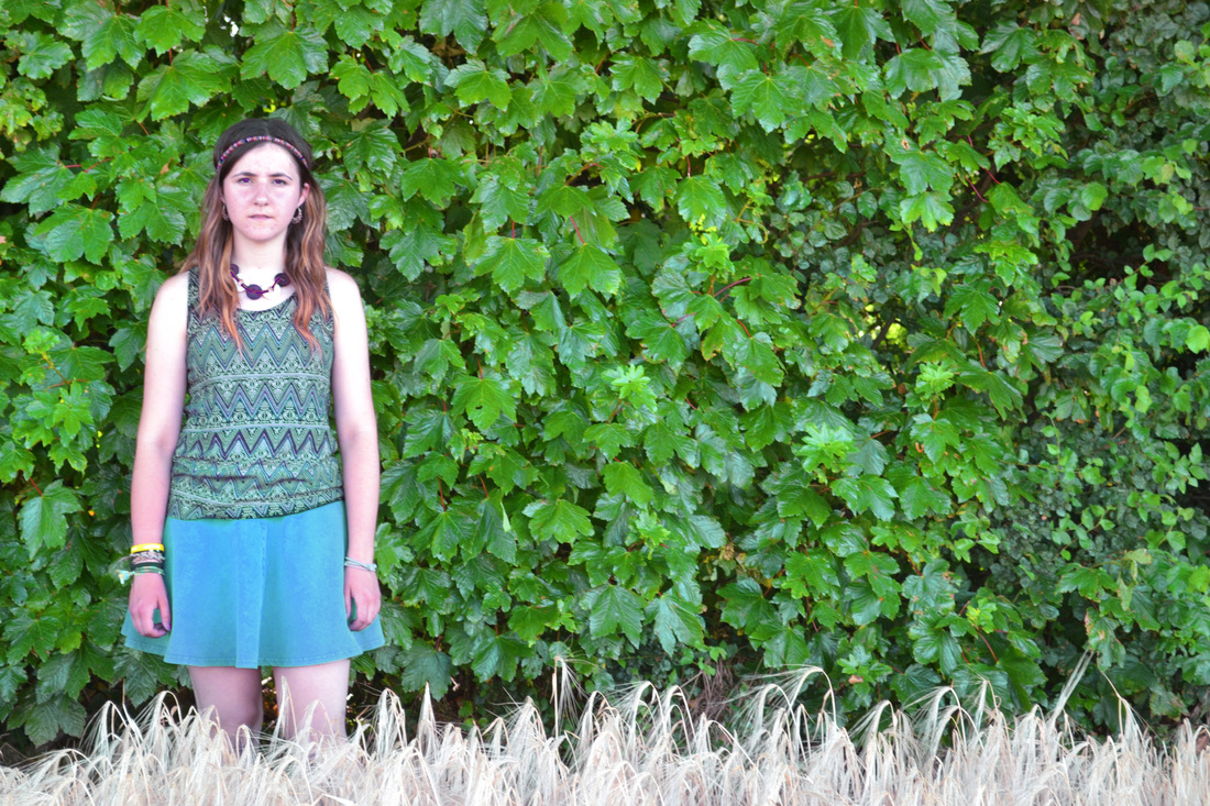
In this photo originally, the sky was bluish grey, and the models jewellry was brown and yellow. I decided to pay more attention to the colours I used, and editied the sky to make it purple, to match her purple top and jewellry which I also editied. I also tried to enhance the brightness of the yellow in the field, so that the two main colours used are yellow and purple, which are complimentary colours in the colour wheel.
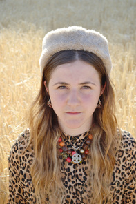
This photo didn't need very much editing, as I thought out the colours before taking the photo. Looking at the colour wheel, I decided to use yellow because of the field, and so made her top mainly yellow, and enhanced some of the yellow used. I also tried to use the colours surrounding yellow, so orange and red. And so, looking at the necklace she wears, I tried to make the red and orange stand out more.
|
Conclusion
Through this project of looking at the different aesthetic affects produced by multiple colour photos, and single colour photos I have discovered that personally, multiple colour photos look more interesting and symbolise a more of a happy positive mood. As appose to the single colour photos, which can represent more of a specific mood by the single colour chosen. For example, the photos above all looked quiet bright and intense, whereas after turning one of them blue, the connotations of blue are then represented showing the picture completely differently, like sad and cold. I have discovered this by doing multiple photoshoots, and then choosing the best and photoshopping them so that they only use a single colour, and then comparing them to the original colourful one, and looking at the different representations between them. This project will influence me to nearly always use a variety of colours, and use colour to my advantage as much as possible, and really think about it when wanting to show a certain mood or feeling.
