AO1 Contextual Understanding
'Develop their ideas through sustained and focused investigations informed by contextual and other sources, demonstrating analytical and critical understanding'
Brainstorm
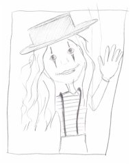
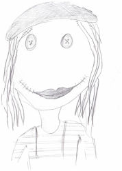
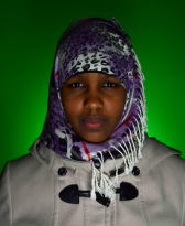
My response to the theme entertainment, was wanting to show a sinister side that you wouldn't normally see. I had many different ideas, which all were quite similar to the landscape unit. I was looking at a more dark and sinister side of entertainment, and maybe what children see when they look at some entertainment that adults enjoy. I decided the main concept was clowns, but instead of just sticking to that idea, I would try to incorporate different ideas into it. For example, have a clown, but with some china doll features, or clowns but tied up like wooden puppets. I chose clowns as the main idea because you can do a lot with them, and I thought the idea that they always have to be happy is like they are being controlled which is interesting, which links in with the wooden puppets tied with string idea. The photographers I am going to research are Martin Schoeller for his portrait work, Erwin Olaf for his many different types of creepy clowns and face paint, and Jorge Miguel for his dark photographs with people with objects and different costumes, with dark lighting.
Idea Sheets
|
|
|
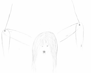
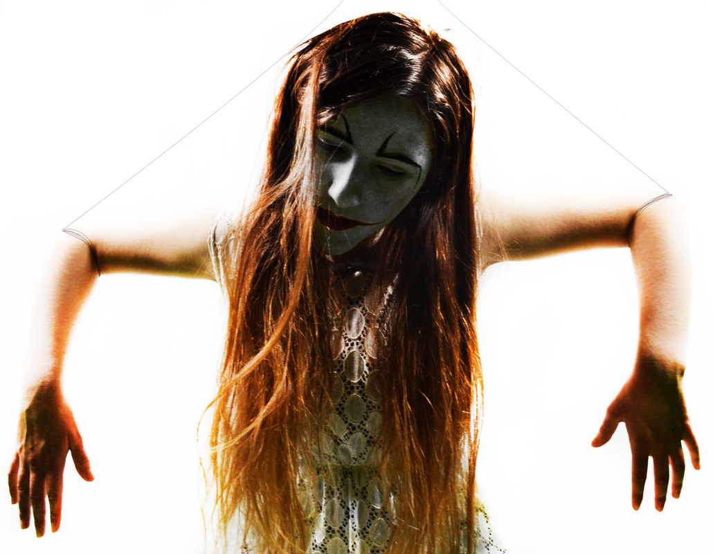
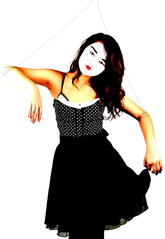
This was my initial idea, and the main one I decided to go ahead with. I had first planned to have each subject with strings attached to each limb, like marionette puppets. For this I thought about actually adding strings to the subject when doing the photo shoot, but this wasn't noticeable once uploaded onto the computers. So instead, I took the photos with the model posing as if there was sting pulling her up, and then drew the string in with the pen tool in photoshop. I also had wanted to make the subject look wooden, by maybe painting it onto her skin, or by using photoshop, however after taking the pictures, I decided not to do this as I was happy with how they already looked.
|
|
|
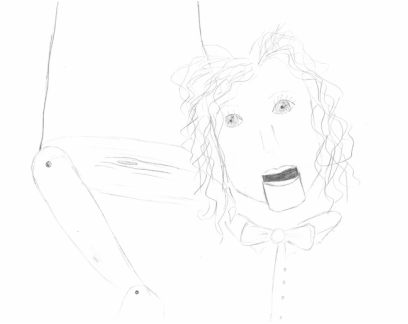
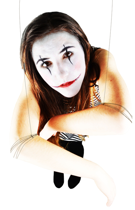
These were some of the ideas I had for each subjects face. I had wanted to have each final piece with different face paint. After taking the photos, I decided not to do this, but instead maybe have two images for each face paint design. I went with a classic clown, a Geisha/clown one, and a mime clown. I chose these as I thought they would all suite a marionettes body, and could all be seen as types of entertainment, making it fitting of the theme.
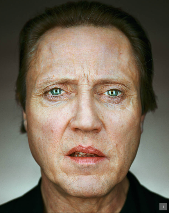
Martin Schoeller-Artist ResearchMartin Schoeller was born and grew up in Germany, and started of by taking portrait photos of people he met on the street.
Schoeller is most known for is his 'close-up' photos. The majority of his portraits are very close to the subjects face, and tend to be taken of well-known celebrities, or anyone known to the public. One of the distinctive features of his photos are the catchlights you can see in most of the subjects eyes. They are also very close to the subjects face creating intimacy. I like Schoellers work a lot, as I think the photos are more personal and intimate then most portraits. I also like how most of the subjects eyes stand out from the rest of their face, like Mark Zuckberg. I think his work is effective, because you get to see closer and more personal than most magazines and other photos capture of the subjects. I think through his work he is trying to say that their is more to the celebrities that we usually see. Normally we just see what the media show us, but through his portraits, I think you see more of them. Schoeller's work could deffinitly influence my work. I would consider taking portraits a lot closer than I had first imagined. |
            |

This portrait photo was taken of Heath Ledger, by Martin Schoeller. I think the photo is trying to say that there is more to celebrities than we think, and they aren't always just what we are shown by the media. I also think this photo might be playing on the fact that normally the public see the celebrity, but the celebrity can't see you, however because the subject is looking into the lens, it is almost as if they can see you, and are looking back at you when you look at them. I think it also connotes that they are real people too, and it isn't fair that the public get to see so much of them through paparazzi, and they deserve privacy.
The photo has a lot of browns in it, like his hair and eyes. Also, you can see catchlights in his eyes. One reason why I think this might be shown is maybe to represent the paparazzi constantly taking photos of them. I think the photograph was taken in a studio, by the way his face is well lit. I think the photo was taken with two big lights, as you can make out two in his eyes reflection. The sides of his face seem darker, which emphasises his face, and the reflection in his eyes exaggerates them. The atmosphere of the photo is very intimate, as it is a very close portrait.
The photo has a lot of browns in it, like his hair and eyes. Also, you can see catchlights in his eyes. One reason why I think this might be shown is maybe to represent the paparazzi constantly taking photos of them. I think the photograph was taken in a studio, by the way his face is well lit. I think the photo was taken with two big lights, as you can make out two in his eyes reflection. The sides of his face seem darker, which emphasises his face, and the reflection in his eyes exaggerates them. The atmosphere of the photo is very intimate, as it is a very close portrait.

This portrait photo was taken of Jack Nicholson by Martin Schoeller. I like this photo because it looks like his head is tilted up slightly, which makes it seem like he is looking down at the camera, which makes his seem quite intimidating. I also like that you can see all of the creases in his face, showing his age.
I think out of Schoeller's 'close-up' photos, this one exaggerates his eyes the least. This might be because his eyes are overshadowed by his eyebrows, or that the hazel brown colour stands out less because of his skin colour, or because of the slight bags around his eyes, which create shadows.
I think again the photo was taken in a studio, by the white background, and the way his face is well lit. Also you can see the catchlights in his eyes showing two light sources. I think maybe the photo might have been photoshopped, to create more depth of field, so that the sides of his face are blurred.
Artist Replication- Martin Schoeller
|
|
For this artist replication, I took these portrait photos against a white sheet. In photoshop I used the overlay layer effect, then used the dodge tool to increase the brightness slightly, then I used the dodge tool but more closely on the eyes, to increase the catchlights in their eyes and makes them look stronger. Then I blurred some of the area around their faces so that there is some depth in the photo. I tried to sharpen some of their features, but this didn't work very well so I undid it.
Erwin Olaf-Artist ResearchErwin Olaf (1959) is a photographer known to address social issues, prohibited social customs and the conventions of the middle-class. His photos tends to be very dramatic and highly stylized, which creates more impact.
A distinctive feature of his 'Paradise Portraits' photos is each subject has a lot of dramatic make-up on, making them look like clowns or fictional characters. Also all of the photos are taken with the models face filling the frame, so that there is nothing else to focus on. Another feature in some of the photos, not all of them, is that you can see catchlights in the models eyes. I really like Olaf's work, as I think it is very dramatic, and quite different to most portraits. I also like the way each face has a slightly different emotion, one being sad, one being happy and another being scared creates more diversity in the series. Olaf's work has influenced me a lot, and has helped develop my ideas for my final piece. Before I planned on having different photos with a marionette in lots of different positions. I now plan on still using a marionette, but instead of just having different positions, maybe each puppets face will have a different emotion, which will be shown very dramatically using makeup. I may even think about making some of the subjects clown faces on marionette bodies. |
'Paradise Portraits' Slideshow |

This photo is of what looks like a female clown screaming as if they are scared or very happy. I think it's hard to tell as the lipstick makes it look as if she should be smiling, but the way her mouth is actually open looks scared rather than happy. I think if the clowns expression showed she was scared, then the photo may mean something about how clowns are supposed to be happy and entertain, but since it is all makeup it isn't how they are really feeling, which links in with my theme, 'that's entertainment', as well as my final piece idea, as puppets are also controlled.
The red lips in stand out, and I think are supposed to resemble a traditional clown. The subjects blue eyes also stand out, as the rest of the photo is quite pale because of the white face paint. There are also catchlights in the subjects eyes, which maybe are there to remind the audience that is it a photo, which is controlled and supposed to be looked at, much like a clown is. The subjects teeth don't look like they are in very good condition, which contrasts greatly with the way all of the makeup is neat and is exactly where it is supposed to be, unlike the less perfect teeth, which maybe connotes everything on the outside is perfect, where the inside is very different.
The photo is composed so that the subjects face is completely filling the frame, so that you cannot even see their ears, which makes you focus on their features, like their mouth and eyes. I think the photograph was taken inside, in a studio from the way it is very well lit, it doesn't look like natural light. Although, from the catchlights it looks like it is lit from the sky, but that could just be photoshopped.
The photograph makes me think of clowns and how they are forced to always be happy, even if they are feeling very different, and how they always have to entertain people. I think the subject looks like she wants to escape, and is tired of being a clown, which is quite dark and depressing, which I think it the mood of the photo.

This photo also looks like it is taken of a clown, by the red lipstick around the mouth. I think the photo is showing a clown, looking quite demented and psychotic. I think this because of the way his eyes are open very wide, and his smile stretches across his face, which is exaggerated by the makeup lips. There are also many imperfections in the photos, like his eyebrows are uneven, and he has lipstick in his teeth as well as his mustache.
I think the message of the photo is just showing how scary clowns can be, and is exaggerating his smile to reflect on how clowns are always supposed to be happy, and make people laugh, where as this photo is more sinister than comic.
Again, like all of the paradise portrait photos, the subjects face fills the frame drawing your attention to his facial features, and imperfections. There are many different textures on his face, like his bristle, the wrinkles around his mouth and cheeks, and the bags under his eyes, which I think emphasis's how rough and unmade this supposed clown looks, which is very different to more traditional clowns.
I think the photo was taken in a studio as it uses quite hard lighting. However, again their are catchlights in the subjects eyes, which makes it look like it is natural light and has been taken outside.
Artist Replication-Erwin Olaf Slideshow
I was influenced by Erwin Olaf's work mainly by the face paint and look of the models. So for both photos, I tried to apply similar face paint to that of Olaf's work. Using the portrait mode on my camera, I took close-up portraits of their faces, using strong lighting to clearly light their faces. Then on photoshop I used the dodge tool to try to make catch lights in their eyes. If I were to do this again, I think I would use the burn tool a bit below their cheeks, so that the photos have more depth.
|
|
|
Jorge Miguel-Artist ResearchJorge Miguel (1968), became an amateur photographer at the age of 14, and started of with taking photos for travel reports. A distinctive feature of his work is it is very stylized.
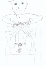
I like his work, as it is all very dramatic, and each photo seems very extreme in the way they are trying to convey a message. I also like the way in each photo, the subject seems to have a different prop, like a blindfold, or headphones, or even tape across their mouth. Miguel's work has influenced some of my ideas, and made me think about adding a prop to each photo like the marionette holding something, or even a hand acting as a puppet master. |
|
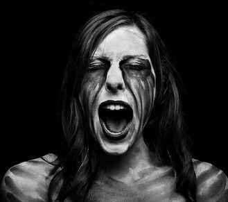
This photo is of a woman screaming, with what looks like tears made of paint coming from her eyes. I think the message the photograph communicates is something to do with how she is in pain, and maybe that the things that hurt people stay with them, through the way her 'tears' are stained on her skin.
The photo consists of colours that are mainly black, though her skin is quite white, with paint stains on it. I think the dark colours connote the pain she is in, and helps create a dark depressing atmosphere.
I think the photo was taken inside, I think this because of the dark black background, and the way her face is very well lit compared to the dark background. I think there was a light source above her, tilted down towards her, as there is shade under her chin.
Jorge Miguel- Artist Replication
For this artist replication, I was influenced by some of his photos but I wanted to change some things and not completely copy the photos. For example, in the first one I liked the pose and look of the original, and so I tried to get the same sort of pose, but wanted the model to look very innocent and so I used a white background for the connotations instead of the grey in the original. In the second photo I just really liked the use of cling-film, and so in my attempt I made it look more playful and less serious, as if the model were trying to escape rather than just looking through like the original. In the third photo I tried to copy the models costume and some aspects of the pose, but instead of using a black background I wanted it to look white so that the model looked glowing. The contrast between the white from the background and the black costume I think makes the photo more interesting and makes the model stand out more, and looks powerful and not just blend in as she would of with a black background.
SLIDESHOW
SLIDESHOW
|
|
|
|
AO2 Creative Making
'Experiment with and select appropriate resources, media, materials, techniques and processes, reviewing and refining ideas as work develops'
Lighting
Hard LightHard light creates a lot of contrast with shadows and highlights. It can be very dramatic, but also quite unflattering. The smaller the light source the harder the light.
|
Soft LightSoft light creates less contrast with shadows and highlights. Soft light makes the skin look soft, and can make the subject look more flattering, and airbrushed. The larger the light source, the softer the light, as it diffuses.
|
One Source Lighting
Butterfly LightingThe camera is directly in front of the model at eye level, and the light is raised to a 45 degree angle. Makes the model look powerful and glamorous.
|

|

|
Rembrandt LightingThe camera is directly in front of the model at eye level, with the light placed 35 degrees to the left of the model, raised to a 45 degree angle. This style makes the model look flattering and dramatic.
|
|
|
Split LightingThe camera is placed directly in front of the model at eye level, with the light 90 degrees left or right of the model. This style makes the model look sinister and extremely dramatic.
|

|
|
Rim LightingCamera is 90 degrees left or right of the model, with the light on the opposite side of the camera. This makes the model look sinister and dramatic.
|
|
|
Two Source Lighting
Clamshell LightingThe camera is in front of the model, standing in-between both lights. One light is placed lower than the model, pointing up 45 degrees, and the other light is above the model pointing down at 45 degrees. This style makes the model look flattering and glamorous.
|
|
|
River Cop LightingThe camera is directly in front of the model at eye level. The lights are on either side of the model, but slightly behind the model which creates a shadow at the front of the face. This makes the model look suspicious and scary.
|

|
|
Spray LightingThe camera is placed directly in front of the model, with the light behind the model facing upwards at any angel, lighting up the background.
|
|
|
Experimentation

This was my first attempt at one of my final pieces. I used this picture because I thought I could do a lot with it in Photoshop, but couldn't add strings to her limbs but experimented anyway. I increased the brightness quite a lot on the model, and the background. I done this so that she looks like she is in a very heavenly place, since the white connotes innocence and purity. However, I also done it as I think the harsh lighting makes it looks like an asylum, which links in with my theme relating to the dark and depressing side of clowns, and entertainment overall. Also, being trapped by a puppet master, which is also like an asylum in the sense that you can't escape.
|
I had planned on making all of the final pieces look like they were taken of dolls, with big eyes. I tried doing this on Photoshop by using the lasso tool to draw around my models pupils, then copying to another layer before making them bigger. I think this looked good, but was hard to get right, and wasn't very noticeable once I had done it. I decided not to do this in my actual final pieces, as a lot of the photos I decided to use, I didn't think the eyes were the main focal point.
Slideshow
For this photo I also made her pupils bigger. I think this looked more effective on this photo, as the outfit and makeup fit the look well. I think by making the pupils so big that they almost fill the whole eye, it gives the subject a sinister look about them.
|

AO3 Reflective Recording
'Record in visual and/or other forms ideas, observations, and insights relevant to intentions demonstrating an ability to reflect on work and progress'
Photoshoot #1- Wooden Doll
I had planned on doing this photoshoot to use parts of the dolls body, and then merging them with the photos I took of my models. However, this idea changed, but this photoshoot was still useful as it gave me more ideas about what kind of pose my models should do.
Photoshoot #2- Clown
Location- Green Screen Room
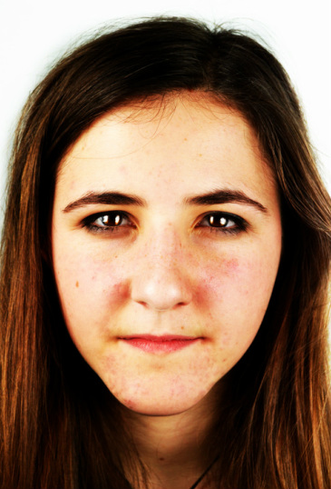
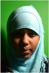
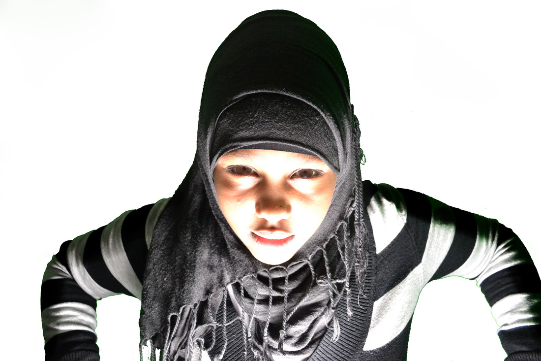
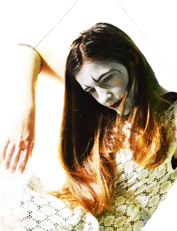
This was my first photoshoot using a model, and I think it went quite well. I painted her face to look like a clown, and made her pose like a marionette would. I tried to get her elbows in many of the photos, as I had planned on attaching string to them, but also thought some of the close-ups came out well, and enjoyed experimenting with all of the different lighting techniques we had learned.

|

|

|

|
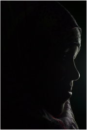
These four photos are my favourite from the photoshoot. I like the first one because of the way her hand in the background is slightly blurred and out of focus, but her face is very close to the lens and is clear, which adds more depth to the photo. Also because her eyes are clearly looking into the lens I think it makes the photo convey more emotion. I like the second photo because of the way the models face is lit very clearly making the face paint look very white, and exaggerates the red lips. I also like this photo as the model is smiling slightly, making is look kinder and different to all of the other photos. The third photo has a more sinister feel, I think from the way the models posed, and her face is quite dark but her arms are harshly lit. I also like the angle of the photo, as by using a low angle it makes the model look quite threatening and powerful. I really like the fourth photo, because by using split lighting you can only see half of her face. The way she looks hidden in the darkness links in with the creepy dark feel of the theme. I also think the lighting makes it look magical, as if the model were a magician which is another form of entertainment, again linking in with the overall theme.
Photoshoot #3- Mime
Location- Green Screen Room
For this photoshoot, I used the same model for my first photoshoot as I felt she was very comfortable in front of the camera, and a lot of the poses would look good with the mime costume and makeup, as they are quite similar. I made her wear a black and white stripy dress, with a black tie around her neck and tucked in, so that it looked like suspenders that mimes often wear. I researched traditional mime poses, and tried to incoperate some of them into the photoshoot, but still trying the think of ways to keep to the marionette theme.

|

|

|

|
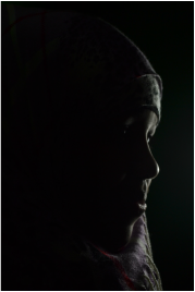
These four photos are my favourite from the photoshoot. I like the first one because of how close the model is to the camera making it more intimate. I also like the pose as it is very mime like. In the second photo, I like the way all of the photo is dark besides for her face and arm, making it look like she is escaping the darkness, as there is only a small amount of harsh light. The pose in the third photo makes the model look like a mime, and I like the way her hands are almost framing her face, similar to the first photo. In the fourth photo, I think the high angle the photo is taken at makes the model look weak and powerless, which emphasises the way the strings that would later be photoshopped in control her, making her look helpless. Also from this angle you can see the models whole body, and the pose of her arms and feet looks very unnatural and uncomfortable which again exaggerates the power of the 'puppet master'.
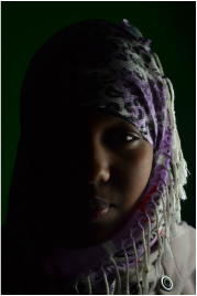
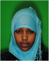
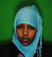
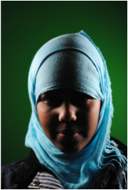
Photoshoot #4-Clown
Location- Green Screen Room
This was the second photoshoot. For this one, I tried to make my model look like a clown, but with some Geisha features at the same time. I done this by painting her face white, with a tear drop coming down her face, and then adding Geisha lips. I think this photoshoot went well, but would try to take more photos with her whole body in shot, as then I would have more limbs to add string to.

|

|

|

|
These four photos are my favourite from the photoshoot. I like the first one because of the pose making it look like a marionette, and the way her hand is almost wiping away the tear on her cheek. I like the second one because of the lighting, which looks a lot more natural than in the other photos, which exaggerates her hair and facial features. I also like the over the shoulder pose. In the third photo, the split lighting makes half of the photo very dark, with the other very light, which I think looks quite sinister. I like fourth photo because of her pose, and I think emphasises the costume which fits the marionette theme quite well.
AO4 Personal Presentation
'Present a personal, informed and meaningful response demonstrating critical understanding, realising intentions and, where appropriate, making connections between visual, written, oral or other elements'

|

|

|


|

|

|

|

|

|

|

|

|

|

|

|

|

|
Evaluation
I enjoyed doing this portrait unit and have learned a lot throughout the project. One thing that I think went well was developing the idea. I had some of the portrait unit planned since the landscape unit, and so I had a lot of ideas when starting this topic and so drawing up idea sheets really helped. My portrait and landscape unit are linked, and so the landscape final piece and ideas influenced some of my decisions in the portrait unit. If I were to do the project again, one thing I would do differently would be the planning when I would do the photo shoots and making sure I had enough time to do the artist replication and editing. One way in which my photography skills have developed is through being introduced to different types of lighting, and experimenting with them and the way my model is posed. I think by the end of the unit, my work has developed a individual style, and the photos look part of the same set. My final pieces look quite similar to how I had planned them at the start with idea sheets, so I think I have met my original intentions.
