Rachel Wise- artist researchThese are some illustrations I found by Rachael Wise. Rachel Wise is an illustrator and graphic designer.
In this group of illustrations she takes a very cynical approach to fairytales, modernising them and showing how things might have turned out if it wasn't in a fairytale world, where people didn't live happily ever after. She done this deciding that fairytales in the real world would be a lot darker than how Disney showed them. I also like the way the photos are framed with an antique mystical feel to it, giving it more of a fairytale feel. |
Dina Goldstein- artist researchDina is a photographer with a background in editorial/documentary photography. She does photography to evoke feelings of shame, anger and shock, and empathy as she often offers an insight into the human condition.
This photo series on the right is called 'Fallen Princesses'. Dina made this to show fairytales without the 'happily ever after', as she hated this aspect of fairytales that children are being spoon fed. She done this by facing the princesses with real life problems like war, obesity, cancer and plastic surgery. |
Experimentation
Sleeping BeautyThis was a photoshoot I done to show the cheap darker version of when Sleeping Beauty pricks her finger on a spindle. In this version, she bleeds a lot so that it looks more dramatic and less glamourous. I stained a white bit of material with fake blood, and then placed it in to sewing machine. However, after looking through the photos I decided the idea wasn't strong enough, and this scene wasn't well known enough.
Princess and the Pea
This way my original princess and the pea idea, where I was just going to overlap matresses. After starting this and thinking more about the idea, I thought of another more obvious way to represent the princess and the pea story. Also, i dedicded not to include characters, and this idea would have had a princess on the top of the matresses.
|
Rapunzel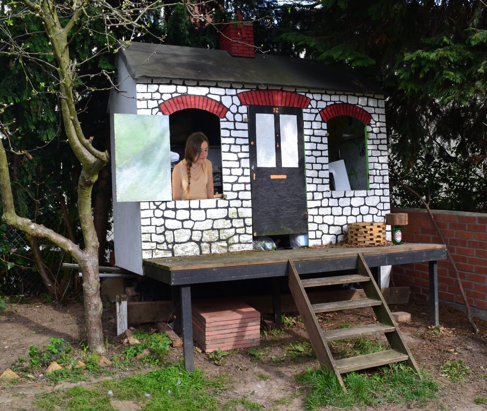
This was supposed to be the Rapunzel idea, and for it I took two seperate photos of a play house and my model looking down, as if it were out of the tree house. Then I photoshopped the princess into the playhouse as if she were looking down at what is supposed to be very far to the ground, which was one of the ways it was supposed to look pathetic, as well as her not very long hair and the play house, and not a castle. I thought this didn't look at cheap as I had wanted it to, so thought of different fairytales instead.
|


Little Red Riding Hood
|
|
|
|
|
|
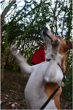
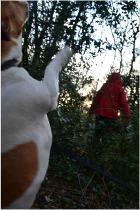
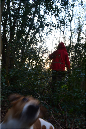
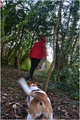
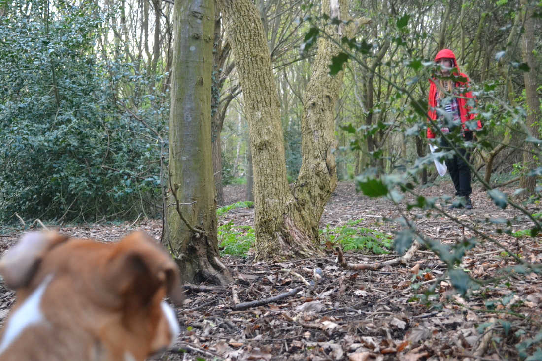
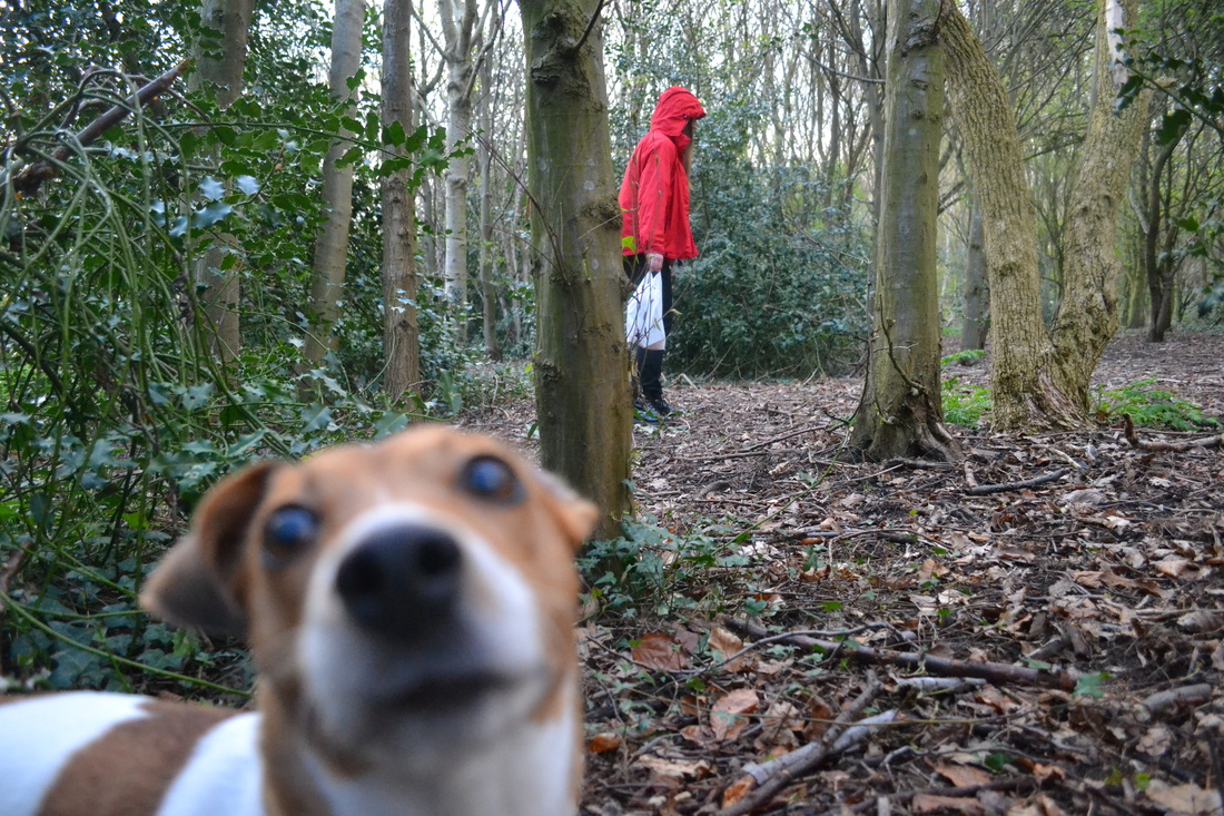
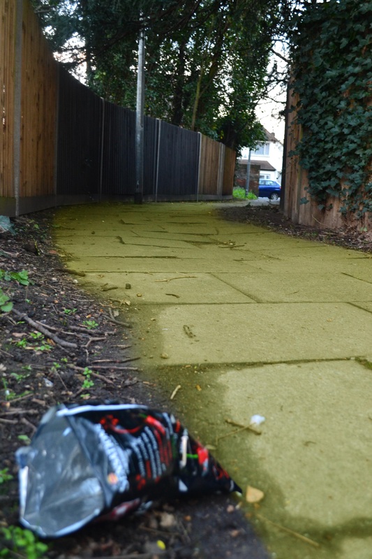
This photoshoot was of little red riding hood and the wolf. To make the wolf look not intimidating at all, I got a small dog that dosen't look scray or dangerous. I dressed the model in a red rain jacket, so that it was more modern and less mystical, like the cape in the real Little Red Riding Hood. I also had her hold a plastic bag instead of a basket, again to make it look less fairytale like. I then went to the forest and tied the dog up near me, as I wanted only part of his body in the photo, like an over the shoulder look from the wolfs point of view, and to show the wolf going after her, but didn't look intimidating, just slightly pathetic. I like the outcome of some of these photos, especially the ones where you can see the sun past the model as it give it more of dark feel, as you can tell its the evening where the suns setting, and its going to get dark. I changed my idea and decided not to do pieces where there are characters in, and just focus on the iconography in the fairytales/fables, so these photos were just experimentation.
Dorothy's Yellow Brick Road
|
|


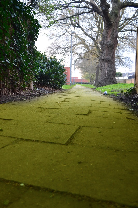
These are the best two best photos from the 'Yellow Brick Road', Wizard of Oz photo shoot. I wanted to show a cheap unfairytale-like yellow brick road, very different from the one in Wizard of Oz. I like the first photo because of the angle following the road, and also the way the road leads up to boring looking buildings, creating a dull atmosphere, also due to the weather. I like the angle because your eye follows all of the lines, on the path and the trees and the lampposts all leading to the building, suggests that is the destination, as Dorothy's was going to see the Wizard, this version is a lot more real and depressing. I also like the piece on the right, because the litter in the foreground emphasises the bleak realistic feel of the pieces, which is what I was trying to show. Also, both angles of the photos show how unclean the path is, and all of the mud and twigs on litter it, emphasising the different between this yellow brick road and the one in the Wizard of Oz. On photoshop, duplicated the layer of the original photo then rubbed out everything expect the path. Then using colour balance, I made both paths yellow, then placed them on top of the rest of the piece.
Final Pieces
|
|
Gingerbread House photoshoot
|
Hansel & Gretel's Gingerbread House


This is my gingerbread house piece that I based on the Hansel and Gretel fairytale. I wanted to look at it in a more realistic way, even if it still is using the gingerbread house. I thought that if the story were to happen in real life, the police would be involved and so the house where the crime happened would have police tape around it. So after doing the gingerbread house photoshoot, I chose the best photo and edited it so that it looked like it was on the grass, and made them both look quite dark. Then I made some police tape on photoshop, by writing it up then putting a plastic effect over it to make it look realistic.
Cinderella's Carriage Photoshoots
Objective: Separate photos to later edit together to make them look like Cinderella's horse and carriage. Then edit it to look very grim and miserable, being a more realistic approach on the fairytale.
|
|
|
|
|
Cinderellas Pumpkin Carriage


This is the second fairy tale piece I made, which is based on Cinderella's pumpkin carriage. For this I took all of the photos separately then edited them together. The only bit that was difficult was getting rid of the wires that in the original photos ran across the horses body. After putting all of it together, I added a layer of rain because I wanted it took look miserable, and more realistic, and it wouldn't have if I had just left it being quite sunny. Like the gingerbread house, I wanted to show what it would look like if it really came true, and show it to be not magical at all like the stories, and just generally more realistic even though it obviously is an unrealistic thing to happen.
Princess and the Pea
Objective: Take photo of a matress and a forest as the setting for the pile of matresses, which I will photoshop together.
|
|
|
For the photoshoot of the forest, I was looking for a setting that would look quite dirty and very unglamourous which is usually how you imagine where a princess would stay, so I wanted to find the opposite. The other photoshoot is of a matress, which I will photoshop to look like a pile of matresses, which is where the princess sleeps to see if she can feel a pea at the bottom. I will photoshop both together making it look like a collage, like the Cinderellas carridge piece.
|
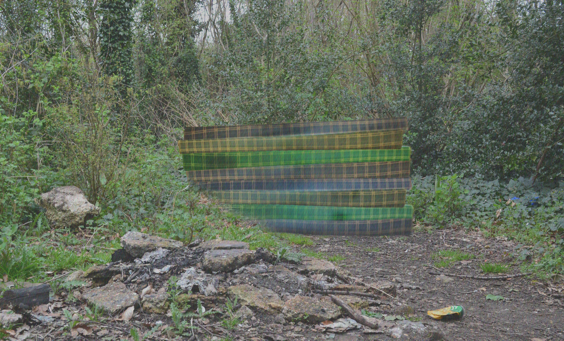


For this piece I had originally planned on having a very different angle, from the top of the matresses looking down, with someone the princesses hair in it, but then I changed this idea after trying to overlay the matresses (in the practice section), and decided to rethink the idea, and also because I had decided not to use any of the characters in the pieces, just iconic items. So for this piece, I took photos of the matress and forest seperatly. I was only able to take photos of one matress, so I cut it out then copied it 8 time and then changed the colour slightly of each matress then placed them all on top of each other. Then I edited the forest photos slightly, playing around with brightness and contrast to make them duller. Then I placed the matresses on top of the forest photo, and rubbed away some of it to look as if it were behind the bush.
