Keith Arnatt- Artist ResearchKeith Arnatt (1930-2008) was a British artist and photographer. Born in Oxford, he studied at the School of Art, and later taught in the fine art department in Liverpool and Manchester. In the 60s and 70s he started to document film and photography.
A common theme in the majority of his photos are they seem to have very little editing, and look more for documenting purposes than artistic. The theme he seems to have explored in these photos is of rubbish, so mainly things found at rubbish tips or just littered. I think this is what I will take from researching this artist, and so for the replication I will take photos and try not to edit them too much, but show random bits of rubbish and some of the things you normally find in bins. |
|

This photo looks like it was taken of a piece of half-eaten raw meat and some egg shells, on a piece of paper or a thin plastic bag. The main colours used are pink and red, and looks very dirty because of all of the dirt around the meat, and makes you think of blood, which adds to the unhygienic look of the piece. The material or paper fills the frame, and looks a lot plainer than the meat, making it stand out and exaggerating the rawness of the meat. It's obviously taken of rubbish, and because it looks unhygienic it fits the theme well. To do my work in his style, I would take close-up photos of the rubbish and have the background also look as part of the rubbish, so similarly a plastic bag or paper. By filling the frame with the meat and paper, you can't look anywhere else and are almost forced to look at the rubbish, which maybe was the message the Arnatt was trying to get across, by forcing people to look at litter maybe they would respect the environment more.
|

This photo was taken of rubbish thrown over the land, making it look like a rubbish tip where homeless people might live. I don't think this photo was planned, like any of his photos, and he just found it like this. This is another thing I will take from looking at his work, so instead of planning how the rubbish will look in the photos, and instead do it kind of like photo journalism, and just keep everything as it is. I think this photo is also trying to represent that a lot of people don't respect the environment, and litter and so the environment looks like this, so I think the message is to look after the earth better. I don't think any of this photo has been exaggerated or distorted, and was left the way he found it, and so the message is stronger as we know is hasn't been manipulated. The high contrast and difference between the colours used also exaggerate how many different types of random rubbish there are, which is something I will try and look for when I take photos of the insides of bins.
|
Keith Arnatt-Artist Replication
Objective: To take photos of rubbish and things that you would generally find in a rubbish bin.
|
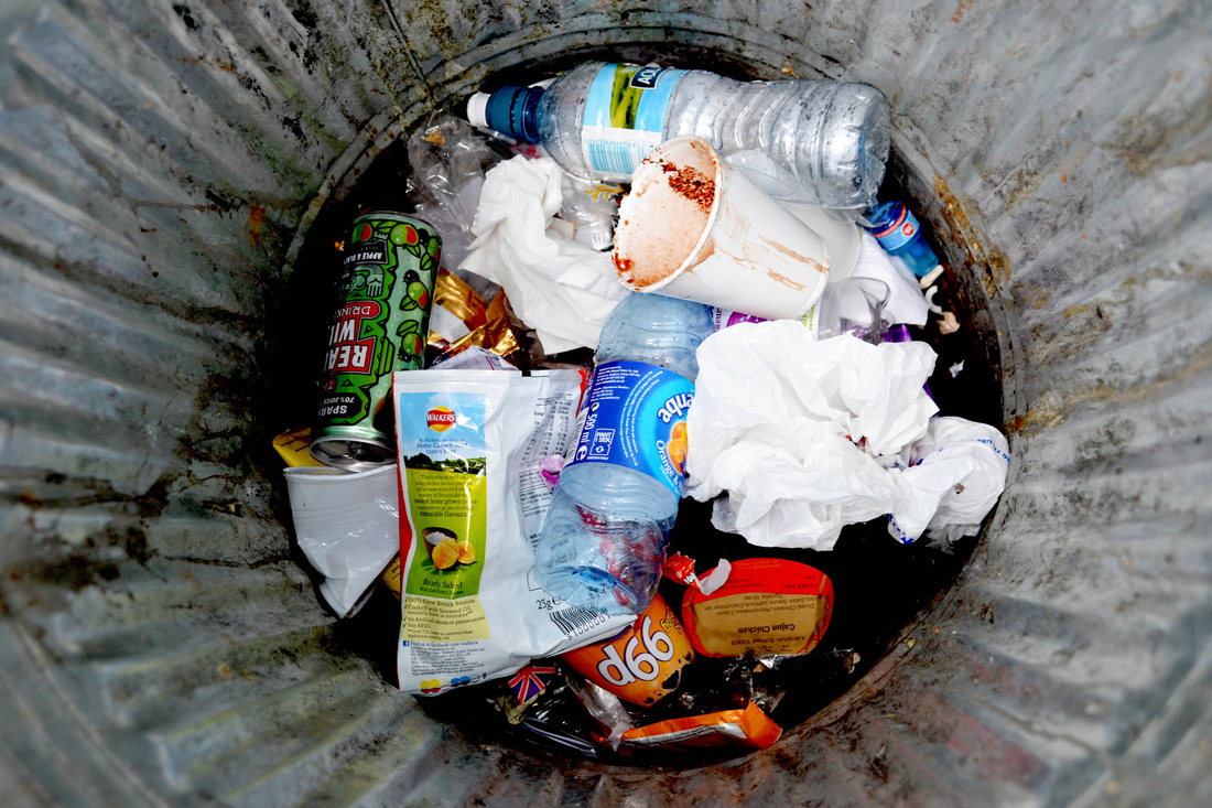
For this photoshoot, I looked through Arnatt's work and decided to replicate it by focusing on rubbish. So for this, I looked through our bins and picked out only a few things, as in his photos, that are more like close-ups there were only a few bits of rubbish. So I choose egg shells, banana skins, and news paper and greaseproof paper to place the litter in. After putting it together I got some wisked egg liquid and poured a very little bit to look more like actual rubbish. Then I took the photos, and tried to make them look as much like his as possible (by filling the frame with the rubbish, and making it look very unhygienic), even though his are more like photojournalism.
|
Although this photo isn't of rubbish, it is of meat which was the focus of Arnatt's photo that I found the most interesting. I placed all of the raw meat into a white plastic bag as I didn't want the background to take attention away from the meat. Also, in a lot of Arnatt's photos, there are plastic bags placed among the rubbish. I used natural lightning and so all of the meat is quite well lit, and looks more natural like Arnatt's photos, where he just used the lighting that was already lighting the subject. Here, like Arnatt's meat photos I tried to fill the frame with the meat so the viewer is forced to look at it, which some might find a bit unpleasant. The reds and pinks of the meat make it look unhygienic and grubby, which is what I was going for.
This photo shoot on the left is of more meat, but in slightly different colours. There is some meat which looks dark purple and another light pink bigger bit as well. I surrounded the meat with normal household rubbish, and decided to make it look like rubbish meat you'd find in someone's house, and not outside at a tip, as I wanted people to relate to it. Unlike the other meat photoshoot, I tried to make this one look more unhygienic, by putting other little bit of meat around it so that it didn't look so clean. In some of the photos you can also see some redish liquid which looks like it could be blood. The look of raw meat normally looks quite revolting, so to show blood and litter it makes the photo quite nauseating.
|
Bin Photoshoot
|
|
|
This is my favourite photo from the photoshoot. I think this came out best because there was a lot of dirt around the bin, and so when I started photoshopping, I played around with brightness and contrast to enhance the dirt. I also sharpened a lot of the objects in the bin so that they looked clearer and the photo in general looked better quality.
|


Car Photoshoot
|
|

|
This was one of the best photos from the shoot. I liked all of the different shapes there where in the car, and how they all over lap and go to different places. On photoshop, I firstly cropped it to be more into the car, then changed the brightness and contrast, then sharpened all of it. I also played around with the burn and dodge tool to add some light and shadows.
|


Piano Photoshoot
|
|
Roadkill Photoshoot
|
|
|
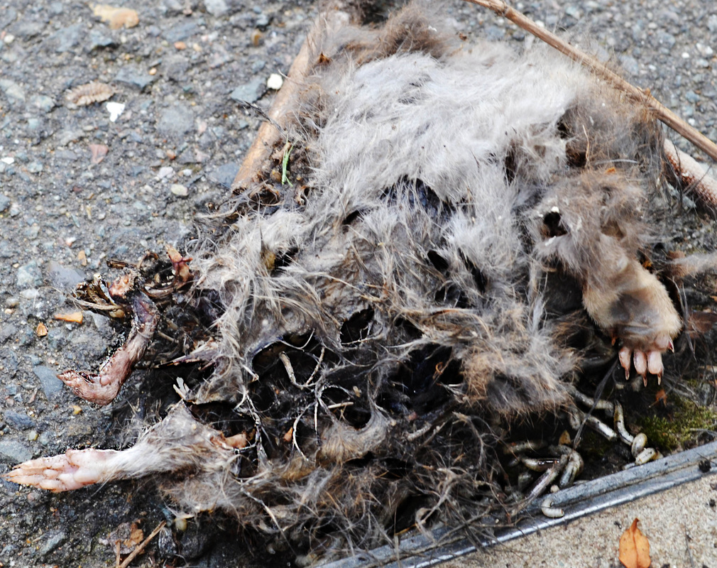
This was my favourite photo from the shoot. On photoshop, the first thing I done was crop it. Then I sharpened a lot of the edges which is what I had to do was most of the photos from most of the photoshoots. Then I used the dodge and burn tool to add shadows so that it looked like we were closer into the rat. Also by adding shadow on the inside of the rat, it made it look slightly hollow, and I think makes the photos look more disturbing.
|


'Animals in Jars' photoshoot
|
|

|
This was the most interesting photo from the photoshoot. Firstly I sharpened all of the edges, then played around with lighting to make it brighter. Then I used the equalised tool, which added a yellowish glow. I liked this effect on the photo a lot because it made it look as if it had been dead for along time, which it probably had but made it clearer. The yellowish glow also makes it look like its in a scientific lab, and creates a sci-fi feel about it, or maybe hints at a psychotic theme. This theme fits well for my reasons for exploring these animals, because aswell as showing the different looks of insides of things, this emphasises how weird it is to keep dead animals, and raises questions about if people where kept in jars like this, and so should make the audience feel slightly unhinged.
|


|
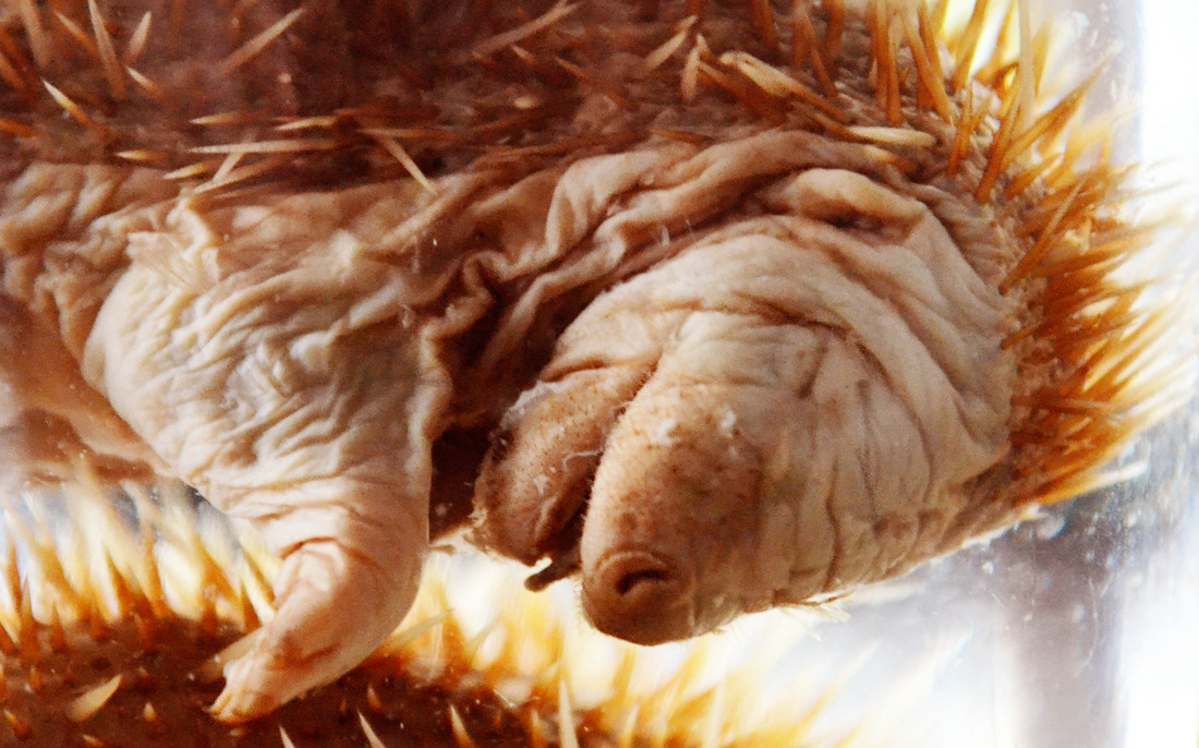
This was another good photo from the same photoshoot. I done the same things I done for the hedgehog, as what I done for the fish. So I sharpened the edges, increased the brightness and equalised it, which again made it look a lot more old, and interesting. This is a hedgehog and looks very small and wrinkly, like an embryo or a very young hedgehog This again should hopefully make the audience think about keeping something so young in a jar and preserving it, and if the same was done with a human how strange it would be.
|
|


|
|
Mouth Photoshoot
|

|
This was an interesting photo from the shoot, where I tried to capture the inside of the mouth. Editing it, I sharpened the edges just to make it look slightly clearer so that it looked like more of a close-up than the original photo. I then played with the curves, brightness and contrast to make the photo less flat. For this photoshoot, I had wanted it to appear as if you were inside the mouth, and so I tried using a magnifying glass but this didn't really work because of the glare on the glass. So for this photo I didn't use the magnifying glass, and instead used a macro lens which worked quite well. I wanted to show the textures on the tongue, to again show the difference in the insides of things that we don't normally look at. So in this photo I manly focused on the back parts of the tongue, showing all of the bumps and ridges that we don't normally look at in detail. To show this clearer I could have just filled the frame with the tongue, but I wanted to show the inside of the rest of the mouth at the same time, so this idea worked better.
|


Fruit Photoshoot
|
|
|
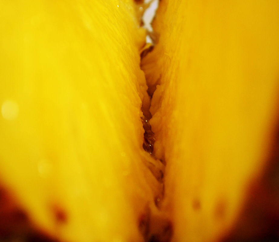
This was one of the best photos from the shoot, showing the bits in the middle being pulled apart. When I photoshopped this, I sharpened all of the middle bits, and used the dodge and burn tool to add shading. I also increased the contrast and brightness to make it brighter and more vibrant. I wanted to show the different textures on the insides of this pineapple, and by focusing on the bit where it's pulling apart I think it captured this quite well, and makes it look quite interesting as it's something people eat, but maybe don't ever look at this closely. And so, maybe it would encourage other people, and me obviously to look more closely at things, as they might be a lot more interesting than I originally think.
|


Combination PiecesThese are the final pieces I made combining different photos from the photoshoots, showing weird combinations of the insides of things. I wanted it to make people have to look at the photo a second time to see what was different about it, or not normal. So some of the combinations have discreet differences like the rat or orange one, and some are very obvious like the pineapple clock one. In the 'car wires & roadkill' one, I took the car wires from the car engine photos I took, and put the into the dead rat, so that it looked mechanical, and almost symbolised the similarities between how the human/animal body work and mechanical things work. In the 'pineapple & clock cogs' one, I put the cog into on slice of the pineapple. In this one I wanted to show that the way a clock all works together to make the clock tell the time, is similar in the way that fruit, like a pineapple, grows and ends up looking quite intricate, and os by mixing a mechanical thing with a natural thing like fruit, I think it represents the similarities between the two. In the 'orange & fish eyes' one I wanted to show to natural things mixed together, and because it is so discreet it may make audiences think more about not knowing what your eating a lot of the time. This is similar in the 'pineapple & veins' one, where I mixed two natural things, but we would never eat insect wings, but we would a pineapple. The 'car tires & mouth' one, I wanted to take a very mechanical thing like a car and show how things like pollution are damaging people by the pollution, and we are doing this to ourselves. So by putting the tire into the human mouth, I think it shows damage on the human caused by a car.
Car Wires & Roadkill
Orange & Fish Eyes
|
Pineapple & Clock Cogs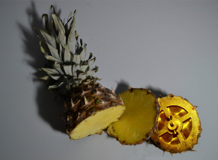
Pineapple & Veins
Car Tires & Mouth
|


|
|
Sabine Pearlman- Artist ResearchSabine Pearlman was born and raised in Austria, and then later moved to American in 2004. After attending a college of art, she decided to take up a career in photography.
Looking at her work in a project called 'Ammo', she took cross-section photos of ammunition, inside a WWII bunker in Switzerland in October 2012. The cross-sections were to see the hidden insides of the ammunition, which is similar to what I am trying to do, by showing the intricate insides of things people don't normally see. I have chosen to look at her work because like the insides of things I tried to show, it isn't normally things you see, and the way that a bullet is so powerful and dangerous, but is so small yet so intricate and detailed is like the way the organs of the rat work that I took photos of, and the way a piano and car engine work, and look very confusing looking at the inside, but from the outside look quite simple. Showing the insides of things should make us appreciate all the work that goes into them, and make them look like something so simple that we don't really pay much attention to how it all works together. |
Sabine Pearlman- Artist Replication
|
|


These are my final pieces from my Sabine Pearlman artist replication photoshoot. Looking through her Ammo photos, I decided to do my own take on it using fruit instead, as it leads of my other fruit photoshoot of pineapple and an orange. So I cut the fruit directly in half, and put them on white paper where I lit them with a very strong light almost directly above them. When I started taking the photos it was difficult not to get shadows in the photos as I had to block the light source slightly because I wanted the photo from directly above the fruit, and so I just had to use the zoom a lot and thought I would later edit out the shadows. However, I edited out the shadows on the raspberry and blueberry pieces, but when I tried doing it on the other ones it made them look too 2D and like they weren't actual pieces of fruit, and looked very flat, so I kept the shadows in these four photos. I think these photos came out quite well, and made the cross-sections of fruit look quite interesting.
|
|
Koem Hauser Artist Research
Koem Hauser (1972) who is a visual artist and photographer who started of in social psychology, and then studied photography where he found his calling. He is known for his work between fine art and fashion photography.
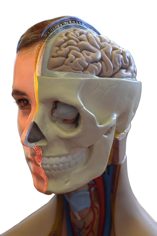
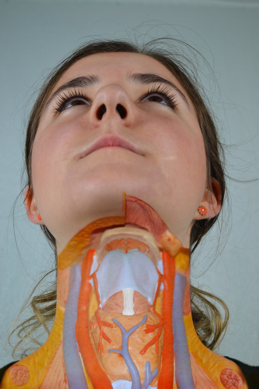
One thing I noticed from going through his work, is in a lot of the images like the ones on the left, he alienates the human body, and makes it look strange and mysterious. From his work, I have taken the idea to have part of a humans body showing, but without the skin. Again, like the Sabine Pearlman work, it is as if he is trying to show how many different organs and muscles working together to make the human body work, are simply covered by skin making it look a lot simpler. Also, this should make us appreciate and take care of our bodies more, knowing how much like a machine they are, with all the mechanisms working together. |
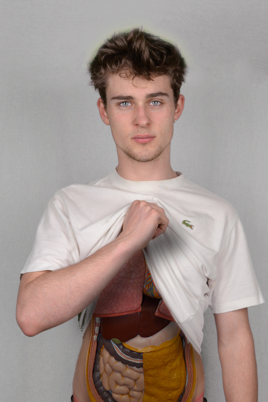
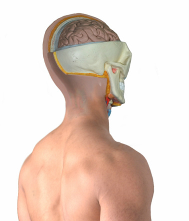
'Human Body'-Photoshoot (Koem Hauser Artist Replication) Objective: Photos of a model of the human body, to later merge with a real model, showing whats under the skin.
|
|
|
|
Final Pieces

|
|


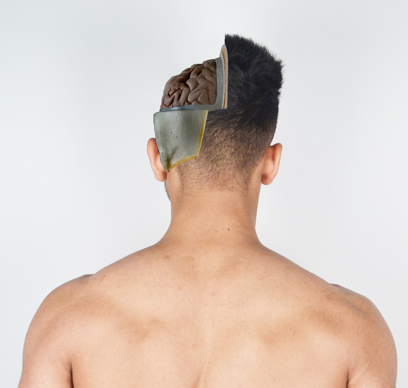


These are my final pieces for the coursework. I made these pieces by firstly taking photos of a human body model from a range of different angles, then doing three photo shoots with three different models in the same positions as the plastic model. Then when photoshopping, I placed the plastic model photo shoot over the real people photos, then rubbed out the rest of the plastic just so that you could see part of whats underneath the skin, but not all of it. I overlaid the plastic body over their body to make matching the skin colour easier, and so it looked more realistic. Then on the first male one, I added shadows under his arms so that it looked more realistic. And on the female one where you can see her neck is of, I had to burn the edges of the top of the plastic part of her neck, so that it looked like her skin was peeling off.
